IPTS - Design System


As part of Dribbble's Scaling Design Systems course, the assignment required that I'd create a Design System for 3 different platforms
The Brief
As Head of Digital for the newly launched IPTS: the Interplanetary Travel Syndicate, a bustling transportation network that shuttles people from world to world within our galaxy, I am responsible for creating three websites, all with three unique offerings.
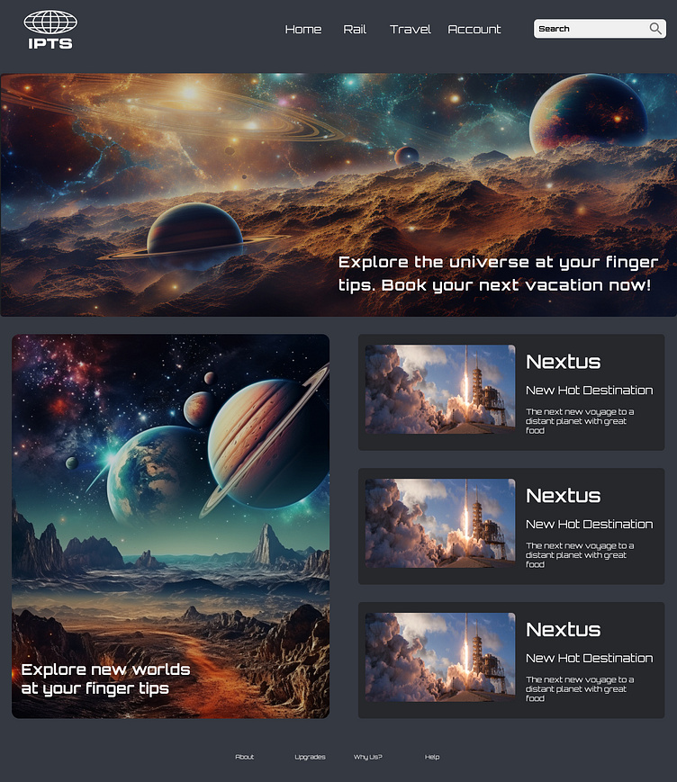
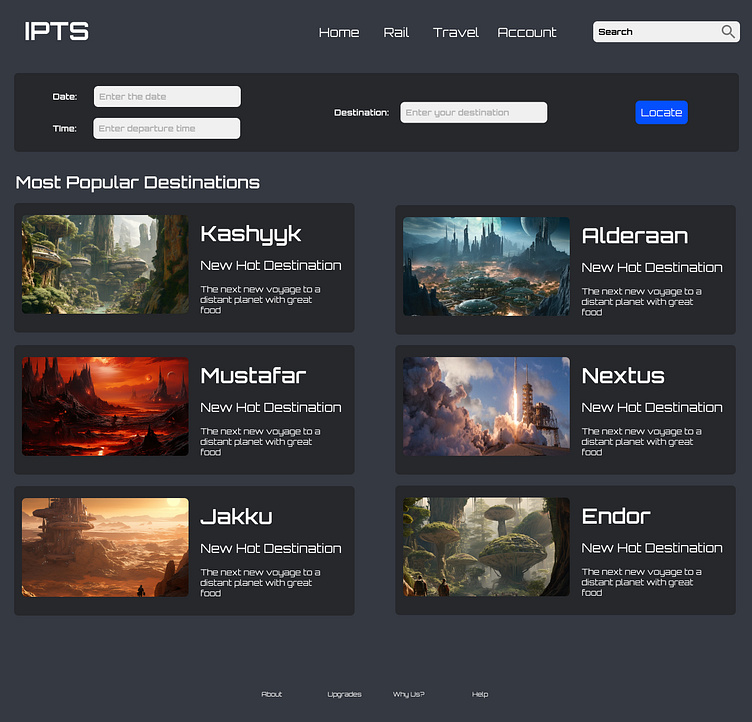
ipts.org, an informational website where you can find the latest news and happenings with the IPTS
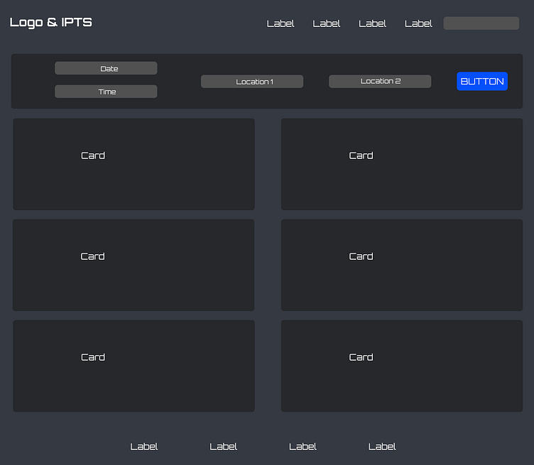
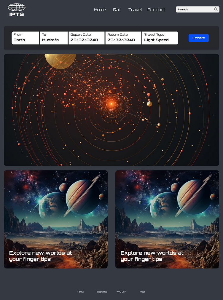
IPTS Travel is a website where you can browse and book travel to and from multiple destinations within our galaxy.
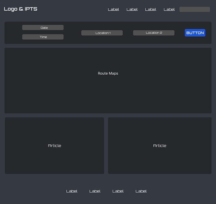
IPTS Rail is a real-time updated web app that views all commuter lines' lines, routes, and times.
To do this efficiently, I have built a design system in Figma that will help feed into all three products, minimizing my workload and allowing me to quickly make changes across the products.
Research and Inspiration
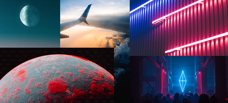
In the genesis of my design journey, two paramount wellsprings of inspiration unfailingly guided my creative compass: color and the awe-inspiring universe of Star Wars. These twin sources of influence spurred my imagination to embark on a voyage into the cosmos, where I conjured vivid mental landscapes of futuristic interfaces. These interfaces weren't confined to the mundane; rather, they were enigmatic portals that beckoned users to step inside spaceships and sprawling stations, each meticulously tailored to the unique sensibilities of diverse species populating the galaxy.
Wireframing
To discern the essential components to construct, I had to determine the structure and framework for each product, enabling me to pinpoint the necessary elements. To accomplish this, I employed a principle gleaned from my coursework, advocating that an element should be transformed into a reusable component solely when it's needed three times or more.
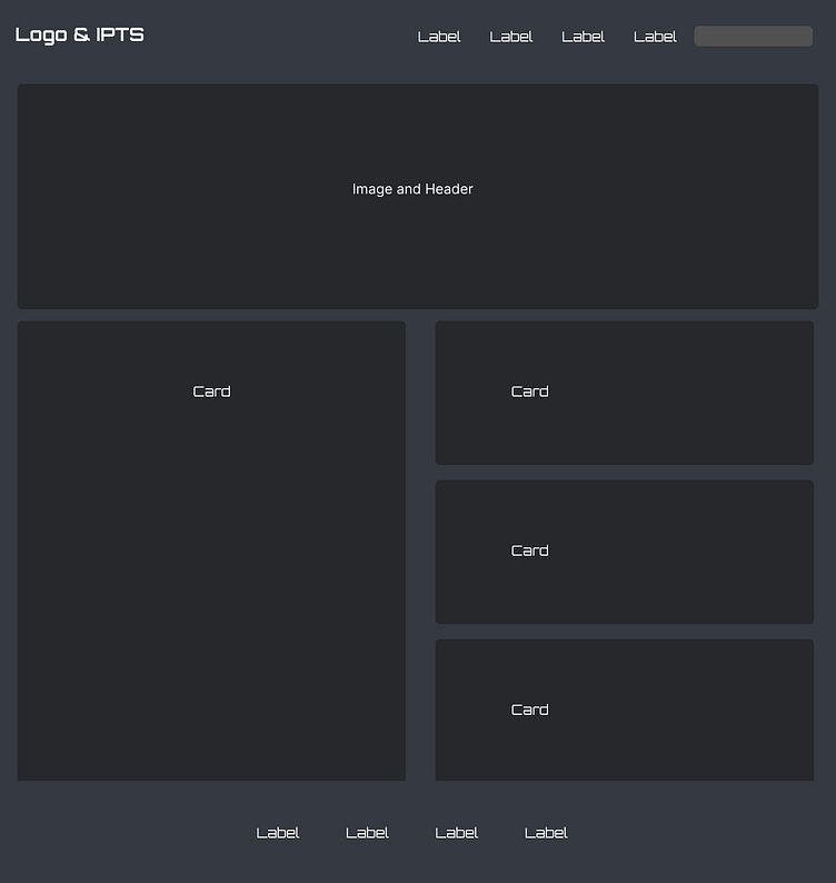
The System
The System was composed of the following components which allowed me to build the pages with ease.
• Typography
• Colour palette
• Logo
• Button
• Card
• Navigation
• Inputs
• Search
The Product
The Rebrand
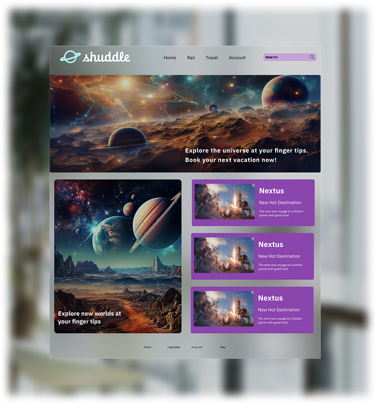
MegaBrand discovered through focus groups that the IPTS name and logo felt very ominous like it was the cold, faceless corporation that was always watching. (“The eyeball-shaped logo doesn’t help,” said one candid participant.) In addition, the IPTS wants to appeal to a younger demographic.
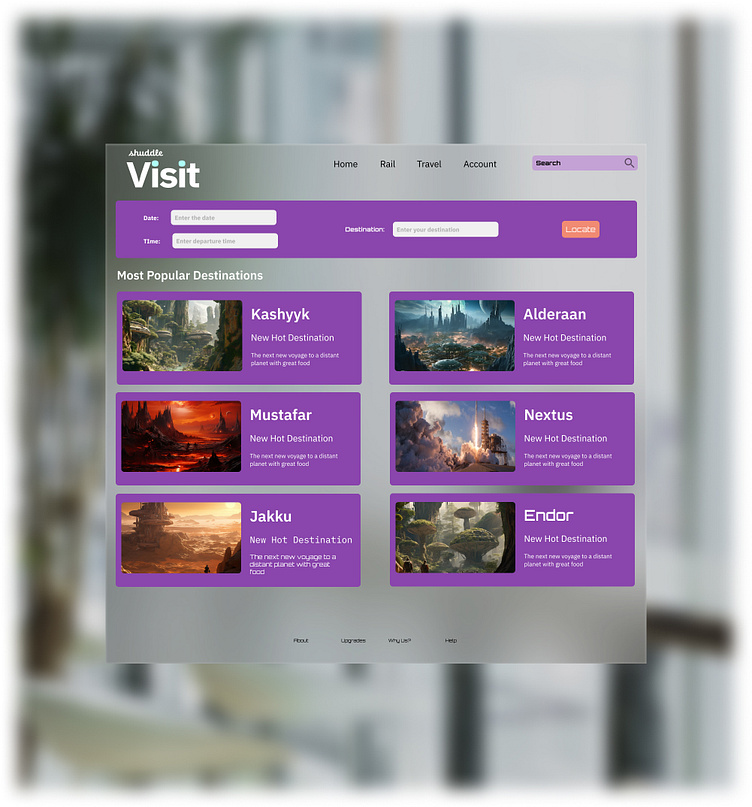
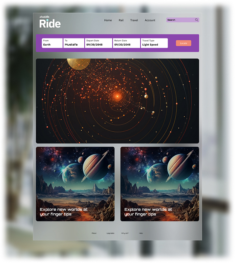
The color palette is fresh and vibrant, and the identity relies much more heavily on the photography of younger people to feel more welcoming and inviting.
The typographic palette relies heavily on the IBM Plex superfamily to both give a wide range as well as make everything feel familiar.
The 3 main products have also been renamed to feel more like a family of products instead of independent offerings:
“ipts.org” is now “shuddle.world.“
“IPTS Travel” is now “Shuddle Visit”
“IPTS Rail“ is now “Shuddle Ride“
Updating the System
In the beginning, the primary task was to initiate the system update.
As I delved into the project, my initial concern revolved around the product's underlying vision. It had been crafted with a vision of modernity, simplicity, a dark futuristic aesthetic reminiscent of deep space, and an overall tone of seriousness intended for a mature audience.
However, Shuddle was a departure from that vision. It exuded a lighter, more playful vibe, catering to the younger generation. Would a simple adjustment of elements suffice? Could we harmonize the color palette? Would it remain accessible and coherent?
With these questions in mind, it was time to take the plunge.
Takeaways
Components play a pivotal role in maintaining unwavering consistency, compelling designers to judiciously repurpose elements rather than incessantly crafting anew, unless absolutely necessary.
While a design system may not serve as a panacea for a comprehensive rebranding effort, it undoubtedly streamlines the process. A rebrand encompasses far more than just colors and typography; it encompasses the very essence of style, the intricate tapestry of color rules and their interplay, the symphony of elements harmonizing on each page, the nuanced voice and tone, and countless other facets.
Consequently, although a design system expedites the application of certain alterations, a comprehensive product overhaul remains indispensable to accommodate these profound transformations.
Furthermore, augmenting or curtailing elements may require a proliferation of diverse variants and tokens to maintain equilibrium within the design ecosystem.


