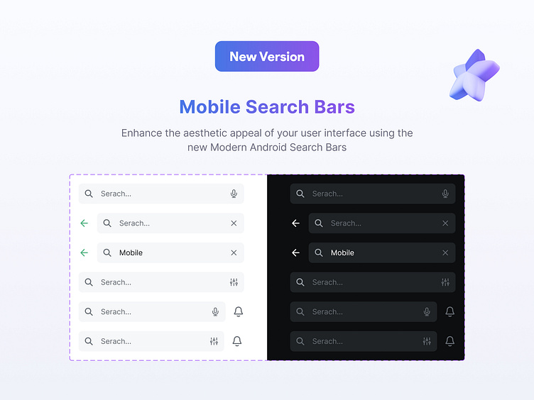
Mobile Search Bars

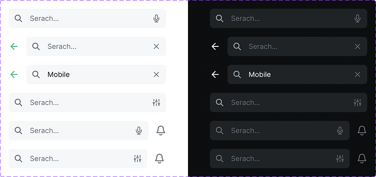
In the context of mobile user interface (UI) design, the "states" of a search bar refer to the different visual appearances and interactions that occur based on user actions. Here are the common states a search bar can have in mobile UI design:
1. Default State:
The default state of a search bar is what users see when they first encounter it. It includes the search bar element, usually with a magnifying glass icon, and sometimes with placeholder text like "Search..." to indicate its purpose.
2. Focused State:
When a user taps on the search bar, it enters the focused state. In this state, the search bar expands or changes appearance slightly to indicate that it is active and ready for input. The keyboard also appears at the bottom of the screen, allowing the user to type their search query.
3. Input State:
As the user types their query, the search bar remains in the input state. It displays the typed text, and often, predictive text or search suggestions appear below the search bar as the user continues typing.
4. Clear State:
After the user has entered text into the search bar, a clear button (usually denoted by an 'x' icon) appears within the bar. Tapping this button clears the text, returning the search bar to the default state.