Eczema Honey Before & After Brand Design & Packaging

Working on the rebranding and repackaging of Eczema Honey was among our top favorite projects.
The client approached us with a straightforward goal: to take their existing brand design to the next level.
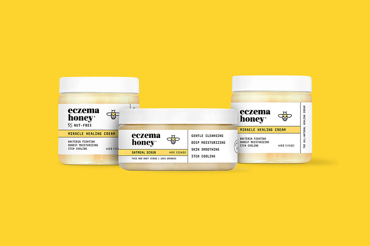
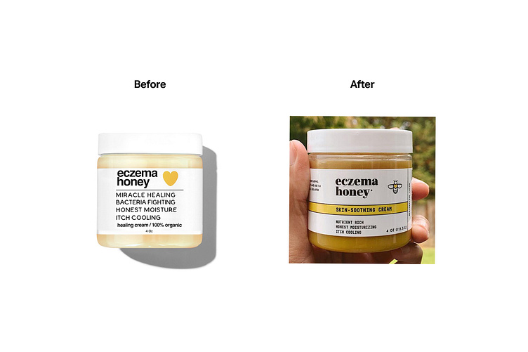
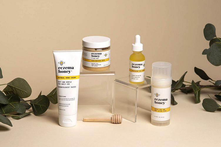
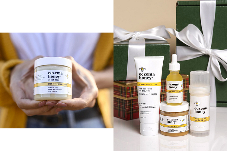
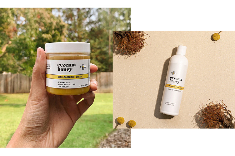
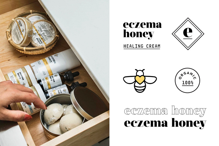
We decided to keep their iconic yellow color and positioned the yellow heart at the center of the new bee symbol, giving the overall branding a visual uplift.
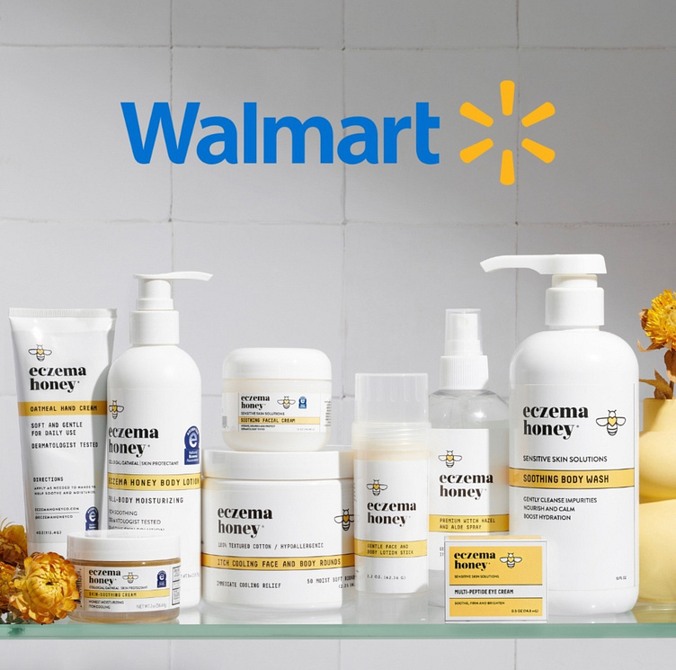
After implementing our redesign, Eczema Honey saw a substantial increase in growth and brand visibility.
Designed by → Garage Design Studio
Need to up your startup's branding game? Let's talk!