Breadcrumbs UI design guide with usability tips

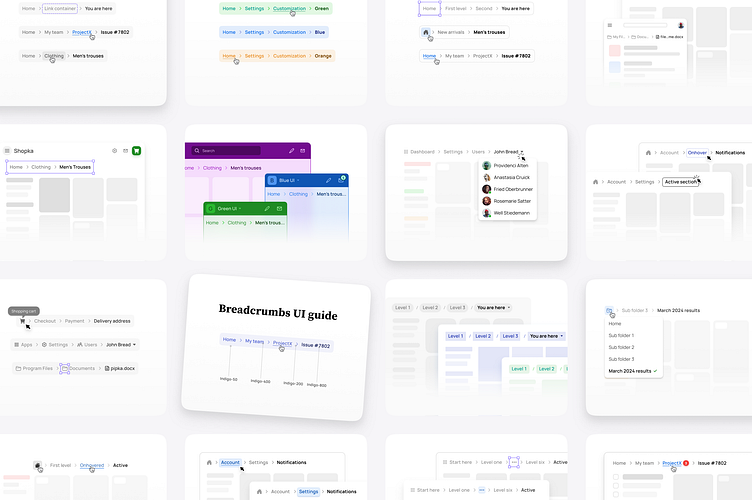
Breadcrumbs UI design inspiration
By understanding the anatomy, states, styling options, use cases, and usability tips of Breadcrumbs UI, readers will gain insights into building smooth navigation UX.
This Breadcrumbs UI tutorial is useful for designers who want to enhance the navigation experience of their websites or applications by implementing a Breadcrumbs navigation.
Here’s why this post is beneficial:
You will understand the anatomy of Breadcrumbs, including separators, items, and home icons.
Gain knowledge about the different states of Breadcrumbs, such as default, active, disabled, and hover.
Explore styling options and custom theming techniques to match Breadcrumbs with the overall visual theme of a website or application.
Discover the diverse use cases of Breadcrumbs across different UX patterns, such as e-commerce, content-heavy websites, multi-step forms, and mobile apps.
Acquire usability tips to ensure optimal placement, visibility, interactivity, and responsive design of Breadcrumbs, resulting in enhanced user experiences.
Full read 👉 https://setproduct.com/blog/breadcrumbs-ui-design


