🔥 Got a Light? 🔥

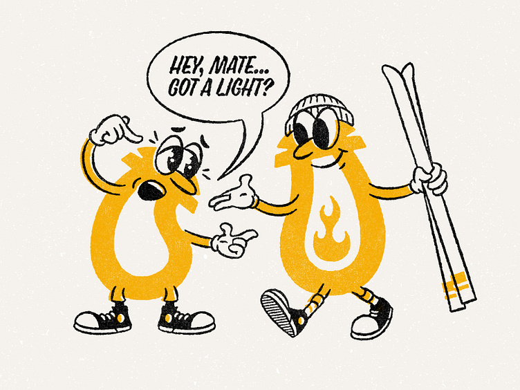
Recently, I was asked by a client to re-imagine their organizations logo as a series of characters. It was a tough needle to thread in balancing the recognizability of the logo with creating dynamic interesting characters. I found inspiration for the visuals in historical character design references from the 70's—think 'Schoolhouse Rock!' vibe where letters were anthropomorphized. The end result was dynamic and interesting, striking a nice balance in keeping the readability of the brand logo while looking like something new.
The final work lives on as a sweet t-shirt for the organization.


