Service Re-Design

I chose an eye doctor Duquette Family Eye Care for a service re-design. I had a lot of fun and learned a lot re-designing this service and I am proud of the overall result for all collateral designed! 😊
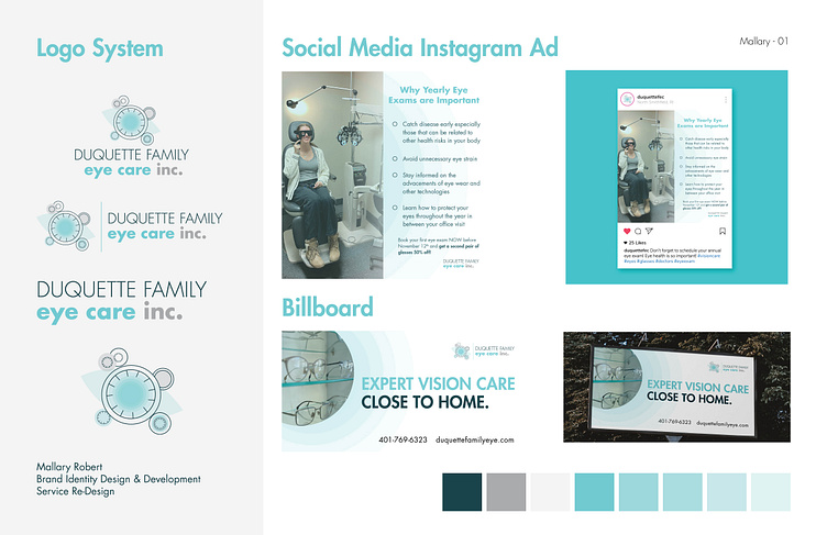
I am particularly happy with the logo. I wanted to include a subtle eye but not let it be the only main part of the logo so I decided to incorporate gear-like shapes similar to the equipment used for eye exams to make it come together more.
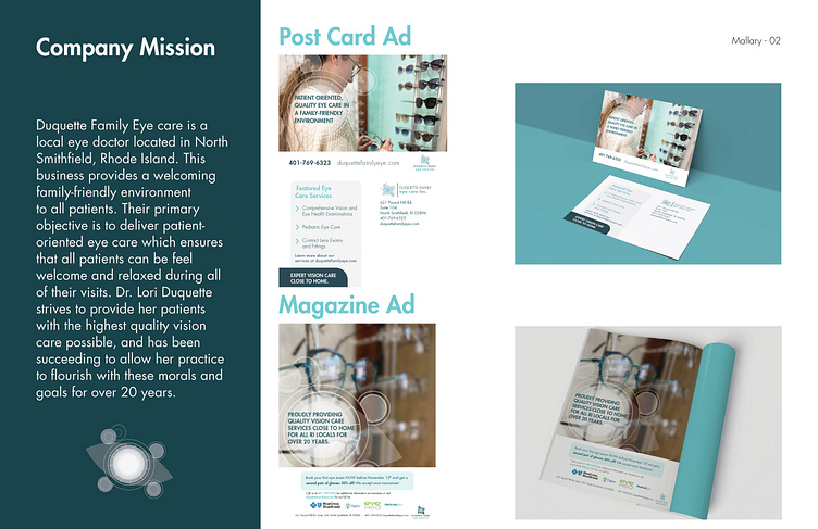
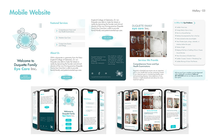
I also really like the color palette for the brand. The different tints of blue that can be seen in the logo remind me of how there are different layers to the eye and it adds a subtle yet effective look. The light color blue I chose also reminds me of clarity and seeing clearly but at the same time gives off a professional clean look that's still reminiscent of doctor's office.Once the logo was finalized I expanded on the brand into several different types of collateral: a magazine print ad, a social media ad, a billboard, a post card, and finally, a mobile website.
Through this process I was able to make elements from the logo into brand assets such as the full icon as a white overlay or the the blue gradient circle to overlay over a full opacity image as seen throughout the advertisements and the mobile website.
"Duquette Family Eye care is a local eye doctor located in North Smithfield, Rhode Island. This business provides a welcoming family-friendly environment to all patients. Their primary objective is to deliver patient-oriented eye care which ensures that all patients can be feel welcome and relaxed during all of their visits. Dr. Lori Duquette strives to provide her patients with the highest quality vision care possible, and has been succeeding to allow her practice to flourish with these morals and goals for over 20 years. "


