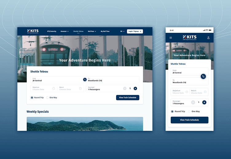
Train Booking Platform Redesign

Hi there! 👋🏻
This is my attempt to redesign KTMB Train Booking Platform 🚆 Link: https://online.ktmb.com.my/Home/Index
I've identified a few usability issues, which resulted in high interaction costs, limited accessibility & a visually disorganised interface:
1) Terminology used (i.e. Origin) is not intuitive
Most users would be accustomed to seeing “From” when indicating their starting point, rather than “Origin”
Deviating from industry convention creates a mismatch between system & the real world
2) Lacks a clear & intuitive interaction design for users to specify their travel type (i.e. return or one-way)
A more straightforward interaction design is to provide users with radio button / dropdown selection to indicate their travel type
However, it adopts a non-conventional approach where there is no explicit option for users to indicate their choice
Instead, the option to indicate travel type is only revealed after users select departure date
3) Inefficient interaction design when indicating number of pax
Using dropdown menu requires users to click, scroll, and select from the list, adding unnecessary complexity to the task
A number counter should be used to allow users to increase or decrease the number of pax with a single tap
Doing so allows for more efficient data entry, reducing the interaction cost & effort needed
4) Poor contrast between input fields & background image makes it challenging for users to discern the fields clearly
Poor choice of background image, alongside the translucent card, creates unnecessary distraction to users
Cluttered background image competes for user’s visual attention
5) Inefficient use of space in the header (mobile view)
Instead of burying user-related option (i.e. Login/Sign-up) within the hamburger menu
Make use of the header space to provide direct access to important functions, increasing feature accessibility
6) No clear visual feedback to indicate selected tab (active state)
Users rely on visual cue to understand their current location within a website, and to confirm the action taken is successful
Currently, when users interact with the navigation header, the selected tab is not tinted with different colour
This creates ambiguity because they won’t be able to discern which tab has been selected
7) Limited accessibility as there is no option to change language
There should be a language selector on the website, allowing users to switch between English & Bahasa Melayu
💭 Happy to hear your thoughts on my redesign attempt!


