iLabs Logo Redesign


Hi Dribbblers, raise your voice
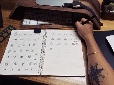
After long days put it back because of many projects. Now I would like to hear your thought about it.
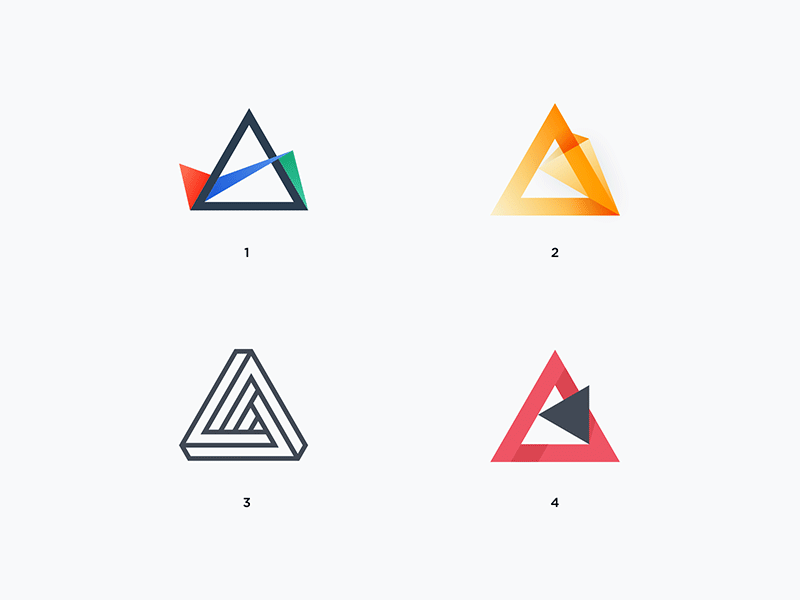
The idea is generated from light prism, a transparent optical element that break white light up into its constituent spectral color. It implies the motto of our business: to turn plain requests into something spectacular.
The symbol derives from triangle, the most naturally strong basic shape that we seen from pyramids, Eiffel Tower to house of card. It also represents your trifecta values: Sharp Strategic Plan, Creative Design and Full-stack Product Development. And if you notice, the colors that we use are RGB – Red, Green and Blue.
Look at Bigger and pick you favorite to help me.
Designed with love. Interactive Labs, HCMC.
Thanks for watching my work and if you like it, please follow my Dribbble | Behance