Beont Typeface | Type Design

A project from 2019
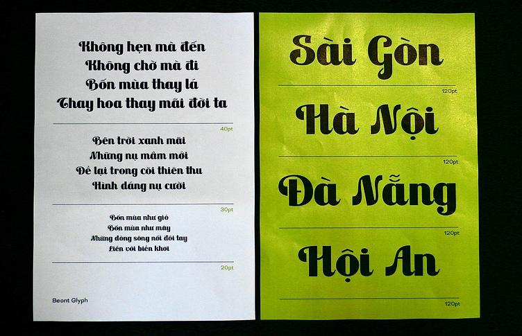
Beont is a display typeface inspired by Saigon newspaper typography before 1985. The reason for this type of design project firstly came from my admiration for the elegant typographic titles of contemporary newspapers and secondly from my frustration when using worldwide popular fonts but having bad Vietnamese support.
With the hope of creating a display typeface that was as close to the handwriting of Vietnamese as possible, Beont typeface was born.
Challenge
One of the main challenges I faced was balancing the consistency and diversity of the letters. I wanted to create a cohesive and harmonious typeface, but also to preserve some of the variations and irregularities that gave the Saigon newspaper typography its charm and character.
For example, I tried to keep the same stroke width and contrast for most of the letters, but I also allowed some exceptions, such as the uppercase E with a thinner horizontal bar but a dramatic swing of the leg or the uppercase L with a thinner leg.
Full Showcase Here 👉
Kim Oanh is a digital product designer specializing in experiential design, covering research, narratives, and executions with a user-centric approach.
🟡 W | onlykimoanh.com
🟡 E | chao@onlykimoanh.com
🟡 IG | onlykimoanh
🟡 Be | onlykimoanh


