Analytics Unveiled: Interactive Finance Dashboard UI

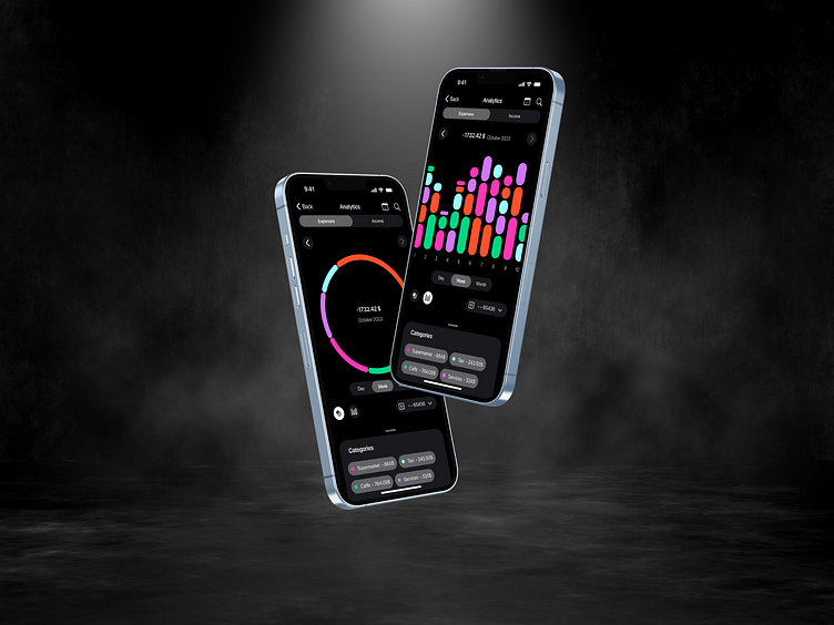
Dive into the world of sleek and sophisticated data visualization with our latest UI design for financial analytics. This shot features a dual-dashboard display that emphasizes clarity and user engagement. The left screen spotlights a vibrant, circular graph that breaks down expenses with a seamless interactive experience, while the right screen showcases an array of colorful bar graphs representing income streams over time. Crafted for optimal user experience, this interface is designed to make financial oversight both intuitive and insightful.


