Crust+Crumb - A French Bakery

Hey y'all! 🥖
Keep up the pace, the weekend is just around the corner!
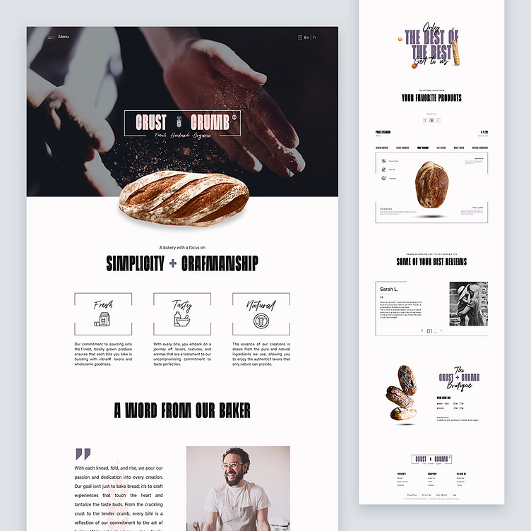
Today, I'm super dope to share the case study of Crust + Crumb, a landing page that captures the essence of a French bakery with a modern twist.
The site isn't just a visual feast but a sensory experience. From the vivid imagery of freshly baked bread to the aroma that practically wafts through your device, Crust + Crumb makes you crave every variety of their delicious offerings.
The layout is clean and crisp, boasting a modern style with square shapes that cut right to the chase. The structured design reflects the bakery's commitment to quality, while staying chic and contemporary.
I've paired a bold typeface with a more calligraphic font in order to add a delightful rhythm to the content, making every word a treat for the eyes.
As for the color palette, the mauve brings that extra dash of sophistication, making you want to reach through the screen and grab a baguette.
All you'll want to do is spending hours chatting with the master baker, his French accent adding an irresistible charm to the whole experience. The website captures this warmth, inviting visitors to not just buy bread but to savor an authentic French connection.
Hope you guys will like it!
Any thoughts on this? Eager to read them where they belong!
Still not following me?
Here is the link to make your day better @weare_wildstudio
Thanks a million for your support and feedback.
Stay green, cheers! 🌲


