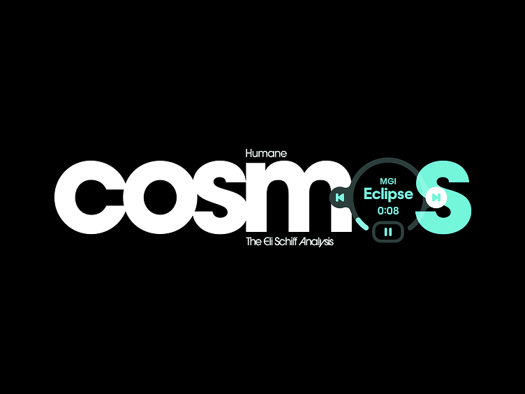
Humane Cosmos: Analysis

Ever since Imran Chaudhri and Bethany Bongiorno published the TED reveal of the Humane AI Pin, my position has been that this device shouldn't exist. Not simply on moral grounds. Of course the premise of this device or category being "Humane" is dishonest 'Techno-optimist' (technofeudalist) whitewashing. But the more basic reason the AI Pin shouldn't exist is because Neuralink, another forthcoming dystopian device, will likely do everything Humane's Pin could ever do, but without the need for the user to "think out loud"—a laughable conception which Humane advertises as a 'feature.'
The AI Pin is therefore a half measure, too early to fill a niche. Given the failure of the AI to deliver accurate results in the company-approved official advertisement spot, one can only assume AI was a last-minute tacked-on feature. If we ever are to get a post-mortem on the internal happenings at Humane, one can all but guarantee that the Humane team never set out to deliver what they have ultimately shipped. Not to mention the betrayal of funding being split out from the company to competitors. One may speculate that too much was on the line not to ship.
Given this, and the actual device’s value proposition being so obviously a misstep to the point of absurdity, I will not address it further. But I will briefly address the device's gestural interface. The fact is, Marvel's Iron Man Suit needn't escape fiction. Let alone in the form of a complex multi-modal gestural input as in the AI Pin.
Here we see that one has to simultaneously coordinate two significantly diverging gestural models between two hands—one in the air (virtually holding the projected display) and one on the hardware. How this could possibly be considered a good idea demonstrates the Hollywood delusion that has overcome our industry without so much as a question. But this should be unsurprising. We now move on to more pressing matters.
First some background. While highly accomplished, Imran has been an understated personality, at least until he has just now been thrust into the spotlight. It is precisely due to this ‘man behind the curtains’ character of Imran’s that I do not believe that he had much input into the Cosmos visual design.
My suspicion is that he was instead busy organizing fashion shows, corporate collaborations, and thinking about Big Numbers. Matters of much more importance than interface design, as one would quickly learn while working at present-day Apple. And so too in the eyes of nearly every living designer today.
Yet who has earned a career crescendo of this nature (if not this form) than Imran, and Bethany? It's undeniable. They are design royalty. And I do not say this in jest or with derision. Today it is impossible to find anyone who will assign deserved credit to the greats. They simply want to take down their betters. This is why I find most criticism of Imran and Bethany disingenuous. As though their persons are up for debate. The repudiation of the product is belied by a generalized open resentment for the Humane team and especially its founders.
The vitriol being spewed at Imran and Bethany—including intrusive speculation about their personal affairs and relationship—is clearly undeserved, and grossly disproportionate. Yes, they’re rich. Just like nearly all other tech executives. Yes, they released a soulless and dystopian product. Just like so many other tech hardware companies. But what differentiates them is that they are otherwise world-class talents in design. This is why they are hated by so many of their peers.
The response may have come as a shock to the two—as now would otherwise have been the time they'd collect on the debts they were owed by the community. But as we've seen, that was the opposite of what was in store.
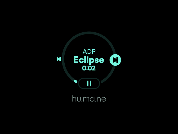
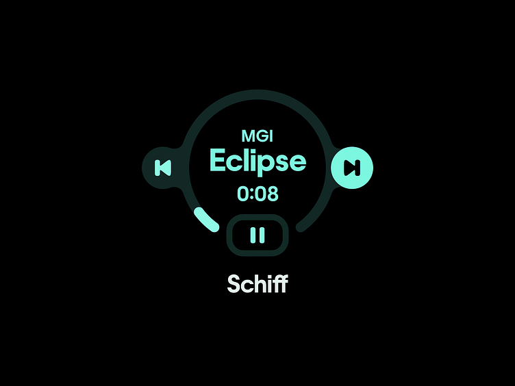
In anticipation of celebrating what they thought would be a momentous launch and celebration of their careers, they not only bought the rights to the instrumentals of Toro Y Moi, but also quietly commissioned an excellent custom typeface, Humane Variable. This typeface is a revival of the much-loved ITC Avant Garde Gothic. I first came to enjoy the original's applications in Com Truise album covers circa 2011.
Humane included an evolution of the signature alternates and ligatures Lubalin put in the original. They even made new ligatures to match their (strange and uncomfortable to type) custom URL, "hu.ma.ne". Perhaps a bit navel-gazey. But it demonstrates an ethos of obsession present in some (quite trivial) areas of the company's portfolio.

The custom typeface is beautiful in display contexts, with many legibility improvements. Part of me wonders whether LoveFrom was commissioned to draw it. But despite all the virtues of Humane Variable and its forebear Avant Garde Gothic, neither was ever meant to be a UI font. Both are by descent clearly intended for display and titling purposes, as is implicit in their being geometric—with narrow apertures and a single-storey lowercase a. And yet Humane chose to use them in both UI title and subtitle contexts, the latter of which is certainly not meant to use a display font.
In fact, Humane Variable is in some respects actually even less-suited as a UI font than Avant Garde Gothic, because it has a lower x-height. Nonetheless, from what I can gather, the Humane team has employed it on-device as the sole UI font. Perhaps they have another cut of the typeface for UI text purposes that is not public-facing. Though given the naming of the fonts, I’d be surprised.
Regardless, the quality of the execution-level typography employed in the projected laser interface does not remotely meet the quality of the typeface itself. This lack of design quality can be seen in their UI renderings: strangely wide (unadjusted) tracking on the main title, and far-too heavy 'Black' weights that will look good in marketing materials, but are overkill in everyday usage. Not to mention that increased boldness further narrows the already-narrow apertures.
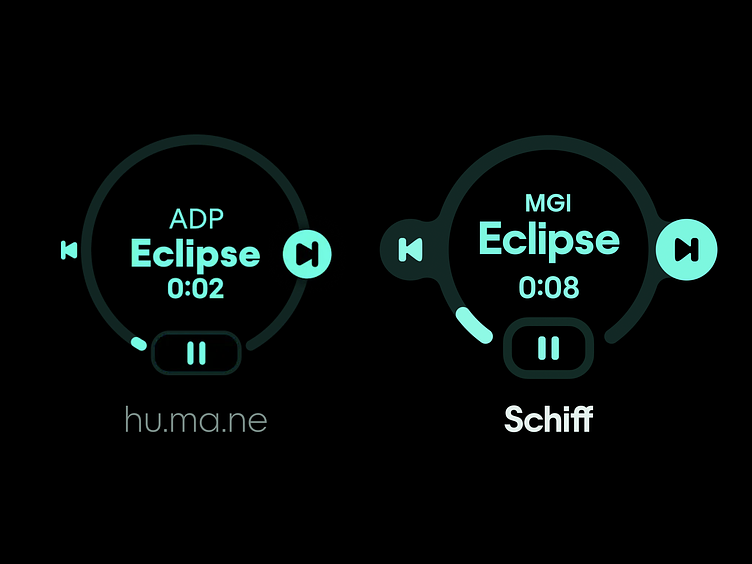
Then we note the array of alignment issues, strange and unconventional containers, overlaps, and near-directly abutting elements (see the left-side "Back" audio playback controls). It is a hodge podge of nonsensical layout decisions that demonstrate a severe lack of attention to detail. These designs are simply not ready for public consumption.
If the AI Pin—and in particular, Cosmos OS—were to be the highlights of Imran's career, as he clearly intended them to be, then he would have a responsibility to make the interface design not only make sense, but live up to what should be his standard—no corners cut. Unfortunately, the design of Cosmos UI leaves much to be desired.
Any observer should not care whether this product succeeds or fails. Judiciousness would hold being unconcerned with product success, as it is of no consequence to anyone except those who are financially tied up in the company. And anyway, Imran is bigger than one product, or one VC-backed company.

I don't feel much need to detail the improvements I've made in my redesign here. They should speak for themselves. However I hope that this single-view redesign exercise helps point to a theoretical alternate image of the design of the Cosmos UI. Not with the intent to improve the device and OS in actuality—which should not exist. But as a concept completely divorced from reality—that of the ideal.
If you enjoyed this analysis, share it with your friends, sign up for my newsletter for more, and follow me on Instagram.


