Day 9: Letters

This is Day Nine of Thirty Days of Logos, in which I share a new logo idea for my design studio, Wildfire Studios, every day for 30 days.
This is a dumb one that should never make it in a logo compilation, and it has zero chances of becoming the logo. But it's important for me to stress that this process is a way of me sharing my work and its iterations until I get closer to something that I feel represents my brand.
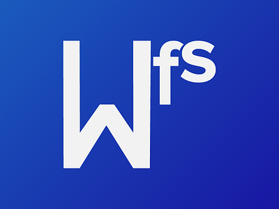
At this point, what I was interested in was exploring with letterforms. I wanted to try putting emphasis on the W, while still including the other characters.
With the original logo for my studio, there was always this weird emphasis on the F of Wildfire. And it always confused people who looked at the logo. I don't blame them. At first, I did, but after a lot of thought, I've come to realize that is' because the F is a very insignificant part of the Wildfire name. Clinging to the side because I thought I had a way to make it look cool and unusual is a poor idea.
So with that in mind, I wanted to try and put emphasis on the W here. I wouldn't call this a failed experiment; I would call it an attempt at something new where I learned that just stringing together a couple words in Manteka and Proxima Nova aren't going to do anything for me.