Beloved city of Chittagong Typography

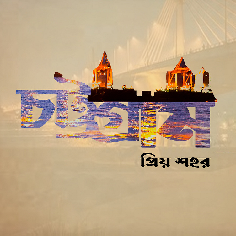
Description: In "Harmony in Type," I aimed to explore the delicate balance between typography and visual aesthetics.
Concept: The concept revolves around the seamless integration of various typefaces to convey a sense of unity and coherence. Each letter was carefully chosen to contribute to the overall visual harmony, creating a dynamic and engaging composition. Cooperated from "Shan gfx" Channel.
Inspiration: Inspired by the elegance of classic calligraphy and the boldness of modern typography, "Harmony in Type" seeks to bridge the gap between tradition and contemporary design. The project draws on diverse influences, from vintage lettering to cutting-edge type design.
Tools Used: Adobe Photoshop was the primary tool for crafting every detail of the typography design.
Outcome: "Harmony in Type" is not just a typographic exploration; it's a visual journey that invites the audience to appreciate the artistry embedded in the alphabet. The final composition reflects my commitment to precision, creativity, and a harmonious blend of design elements.
Conclusion: This project serves as a testament to the power of typography in visual communication. "Harmony in Type" is an ode to the timeless beauty of letters, showcasing the impact that thoughtful design can have on the view.


