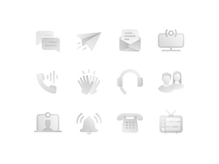
Meeting chat roondy detailed icons
I can admit that I have a hard time with new styles. Like this one here. Like there is a habit to do stylization, but it turned out, to a certain extent, to the icon-glyphs. Logos can not do, too saturated, not minimalist turn out. But also a little more complex icons, bordering on illustration is not so easy. All the time hangs the thought that it is not necessary to complicate. "Should I take that out?" As if an element or decoration is unnecessary visual garbage. But it's more interesting with it. It's like adopting a new worldview=) And I still feel like a kid in composition and visual estimation of the "weight" of icons in the overall set. I always use grids and masks when creating icons. And still never once was that collecting all the icons side by side in a set, they immediately look proportionate. Maybe there are some plugins already? Give me a hint, please.
Other icons can be found on AdobeStock


