Day 11: The Fishing Logo

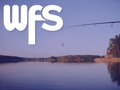
This is Day Eleven of Thirty Days of Logos, in which I share a new logo idea for my design studio, Wildfire Studios, every day for 30 days.
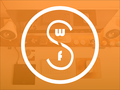
This is the first logo idea that I've come up with since we started thing thing that I really actually like. It took me a while to come up with what I like about it, but I think there's a certain care to detail in it. I like the descender, for example. It reminds me of fishing. All the rounded edges, to me, are particular calming and carefully considered. There's a level of care in this logo that I strive for in my client work.
The W is Bauhaus 93 and the F and S are modified versions of Proxima Nova. I don't think this logo will necessarily work: while it is carefully considered, it also doesn't necessarily tell the right story. And perhaps more importantly: that F makes the whole logo taller than it needs to be, and making it the same size as the other letters looks silly.
What do you think?