CHICKO - Brand Identity Bento

ABOUT THE PROJECT
CHICKO, a gastronomic haven of indulgence, beckons food enthusiasts into a world of irresistible flavors and hearty satisfaction. As a fast-food haven specializing in delectable chicken delights, CHICKO is a symphony of taste where every bite tells a tale of savory perfection.
Their mission is clear: to be the ultimate destination for chicken lovers seeking a burst of flavor in every bite.
Wanna create something great too? Feel free to contact us ►
ABOUT THE LOGO
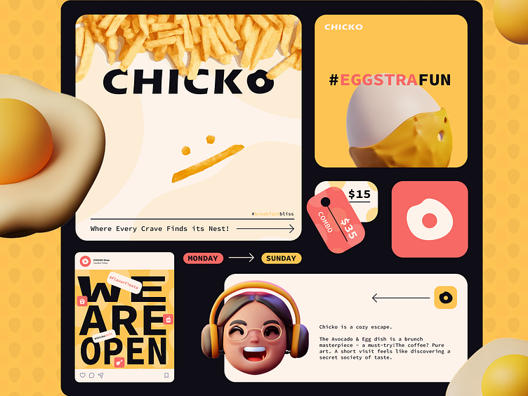
In the realm of simplicity and modern aesthetics, the logo embraces the essence of minimalism. Set against a vibrant yellow backdrop, the logo features a solitary fried egg, its contours capturing the allure of uncomplicated design.
The simplicity of the yellow background symbolizes warmth and positivity, evoking a sense of friendliness and approachability. The fried egg, a culinary classic, represents the heart of the brand – a place where simplicity meets flavor.
Ideal for various digital platforms, the horizontal orientation of the logo ensures seamless integration into websites, applications, and social media.
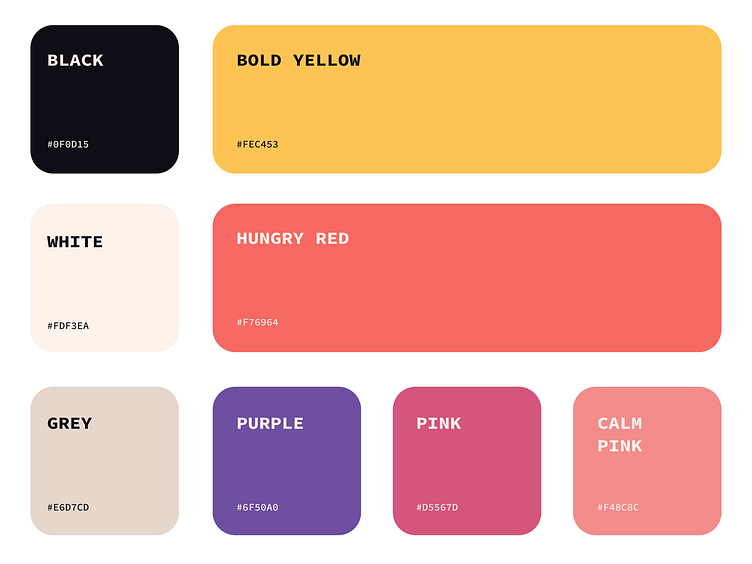
About Color Palette
Embracing warmth and vibrancy, the primary color palette is carefully curated to convey a consistent and inviting aesthetic across all brand communications.
This harmonious blend of warm yellow, warm red, black, and warm white forms the core of our brand identity, instilling a sense of cohesion and professionalism across all mediums. In digital ads, illustrations, presentations, and printed campaigns, the secondary color palette complements these primary hues, ensuring a visually engaging and unified brand experience.
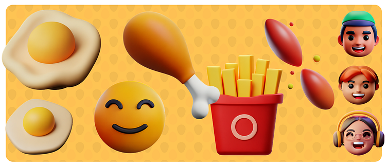
About Illustration Elements
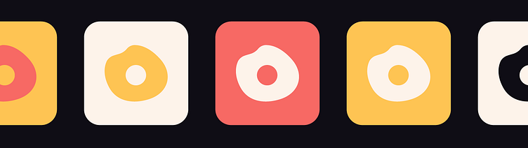
The decision to employ 3D illustrations for the brand stems from a desire to infuse a dynamic and contemporary visual language. 3D illustrations offer a depth and realism that aligns with the brand's modern identity, elevating the overall aesthetic and providing a visually engaging experience. This choice not only captures attention but also communicates a sense of innovation and forward-thinking, setting our brand apart in a visually competitive landscape.