Gridify Technologies / Logo

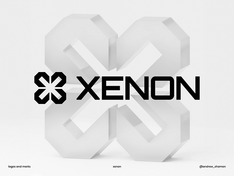
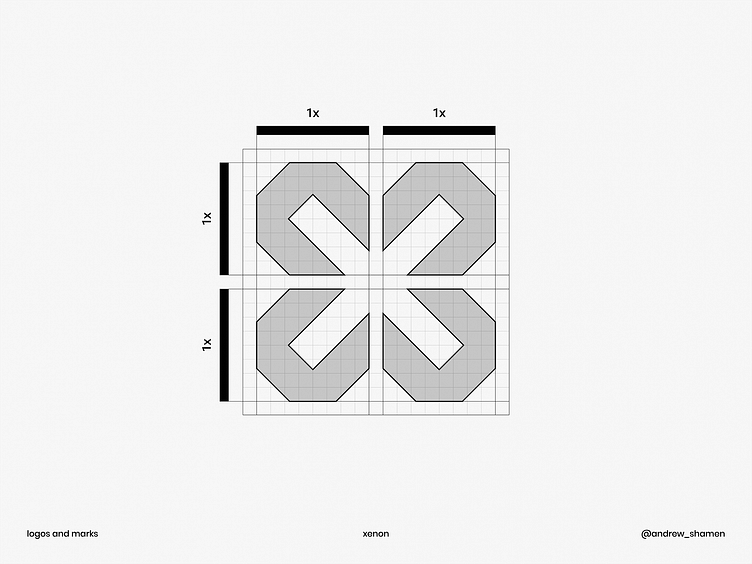
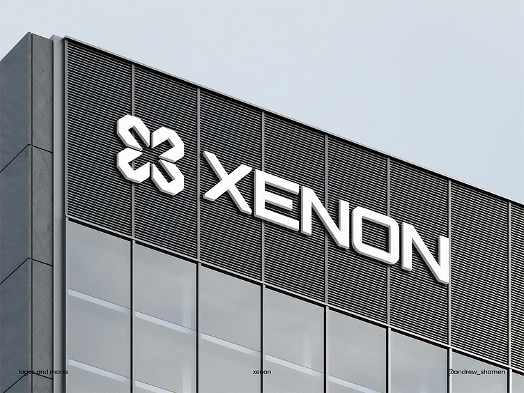
I'm currently exploring the creation of logo marks, focusing on the synergy between a single letter and a minimalistic shape. Sticking to the principle of "less is more," I believe that using simple and strong shapes contributes to the logo's distinctiveness, memorability, and versatility in future use cases.

Also, I'd like to ask you to follow my Instagram. I'm going to be sharing fresh designs regularly. Stay tuned!


