v mark + process


I’ve been working on this personal landmark during the weekend.
Concept:
I’ve always been a huge fan of Didone typefaces, mostly because of their contrast and the subtlety they convey. The fact is they are often associated to fashion (instead of tech) with a classic/old look and feel, plus they look very feminine. It wasn’t was I was looking for.
Yet, I tried to make something inspired by Didone, but in favour of a more masculine style which would also be highlighting the modern and minimal approach behind my work.
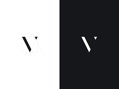
Once I had a little concept working, I managed to refine it on a grid and to work on its proportions using the golden ratio. When finished I also found that it looked really close to a minimal pencil shape, which fits well with the fact I’m a visual designer. The result is really humble, I’m definitely not a logo designer (I have a huge respect for these guys), but I guess that the final look is yet acceptable.
End of the story, hope you’ll find this interesting. I attached the guidelines for the curious ones. Thanks to the amazing @Anne Thai for her feedbacks.
Enjoy your week friends.


