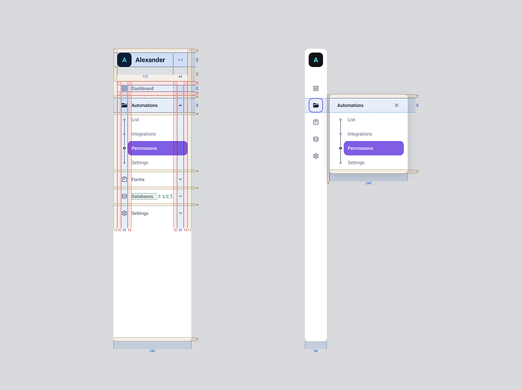
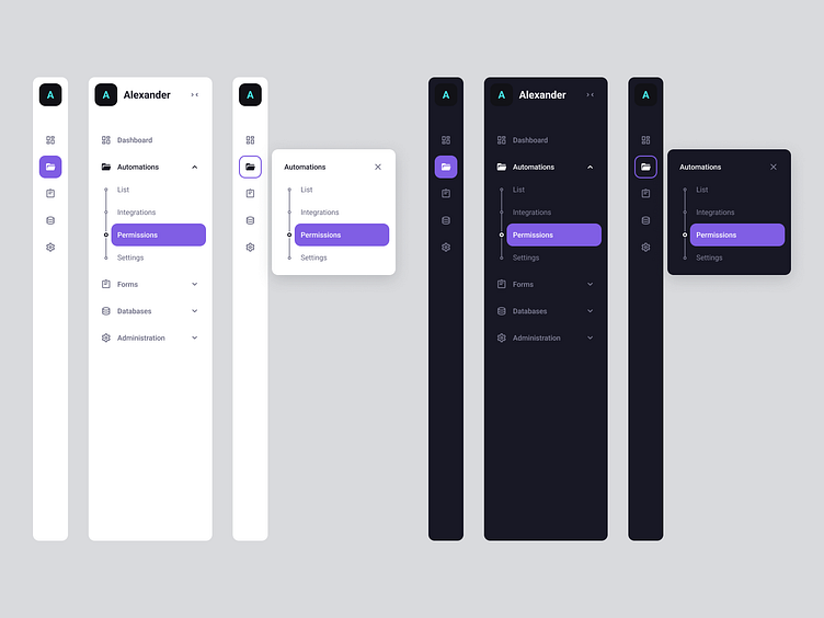
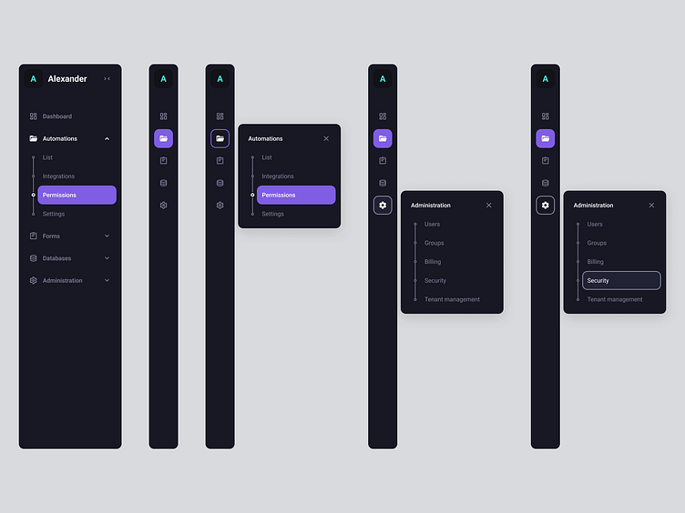
Vertical navigation

The navigation of a web application can make or break the product experience. It is the way a user will discover and access what a platform has to offer, and also, will be informed by their current location.
How easy is to navigate to or from a certain location, how easy is to identify what the current location is, and how easy is to interact with the element will define how the user will perceive the product on first interaction, and, later on, how fast can one navigate will shape the way a product is perceived.
A user can create their first impression is as little as 50 milliseconds.
A user perceives and remembers a product as being easier to use compared to how complex it actually is if a product is easy to use.
"If this is poorly made, how bad are the other, more complex interactions" - one might ask.
Steps

Intro
First step is always to understand what your problem is, or could be, and discover what needs to be done in order to deliver the right feature to the users.
The "design" of an element starts long before one would touch an UI tool. UX informs UI, not the other way around.
In order to do that, you need to know where the users expect to find a feature and, before that, how to structure them. For that, we have that wonderful card sorting exercise where you have the users (ideally) group a given set of features on individual cards and let them arrange them themselves. If access to users is impossible, have an internal meeting and decide the order using the same technique -- sometimes reality is harsh, there's no access to real users, but always try to test your designs. And, of course, secondary research is golden.
Everything we do should be accessible, we need to focus more on this. We build for the user, not for the eye candy feeling - this would be the outcome a well made design. It's amazing to have a great looking interface, we even test for that (hello there, desirability studies! - yes, that's a thing), but it's no good if the respective interface is invisible to users, right?
In real life, in many cases, accessibility is a must. A requirement. We shall focus on a relatively small, but nonetheless important part. Contrast.
Shortlist of things this design tried to check - for both the light and dark themes:
The contrast between text color and it's immediate background color (min. 4.5:1 for AA)
For buttons - the text must have at least a 4.5:1 contrast vs. its color and at least 3:1 on its color vs the background color it's placed on top of.
The contrast between two states of the same element: Resting -> Hover, Hover ->Focused (min. 3:1 for AA) -- that's why in this design I've chose to use a hover state with a border on it - clear differentiation between states.
The contrast between icons and immediate color (min. 3:1 for AA)
I've also chose to have different colors on focused states for when the navigation is collapsed for the times when a group has an option selected from it vs. when a group is open and the destination selected is not part of it.
Sizing