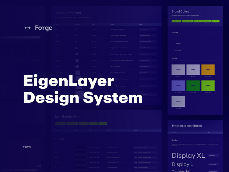
EigenLayer's Design System


EigenLayer provides protocol with network validation services. They also provide developers with access to the Ethereum staked capital base and decentralized validator set.
Project Vision
The Forge team created a powerful toolkit for creating beautiful and user-friendly applications on the EigenLayer platform. With the increasing popularity of EigenLayer and its role in revolutionizing Ethereum, there was a need for cohesive and intuitive user experiences across the ecosystem. This design system provides a comprehensive set of design guidelines, components, and resources that empower developers and designers to build consistent interfaces that align with EigenLayer’s brand standards.
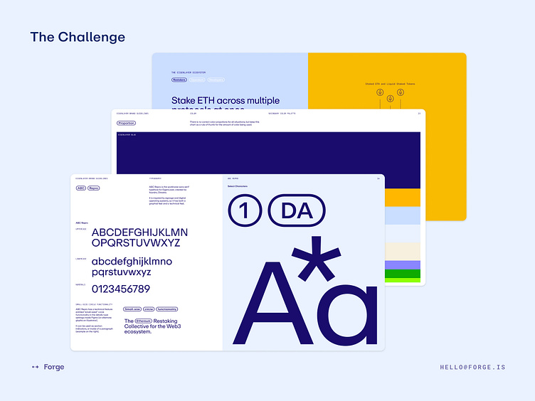
We needed to create a design system that aligned with the existing brand. The visual direction of the brand utilized elements of Brutalism with high contrasting colors, typography and scale. We wanted to translate this into the product, but maintaining usability and responsiveness, keeping UX at the forefront of decision making.
We had the added challenge of managing both light and dark backgrounds within the same system. Typically you’ll find that systems are either in a light and dark mode, but this brands allows for a variety of background colors.
We needed to incorporate high contrast in terms of scale for both typography and color to align with the existing brand guidelines. The team achieved this by doing the following:
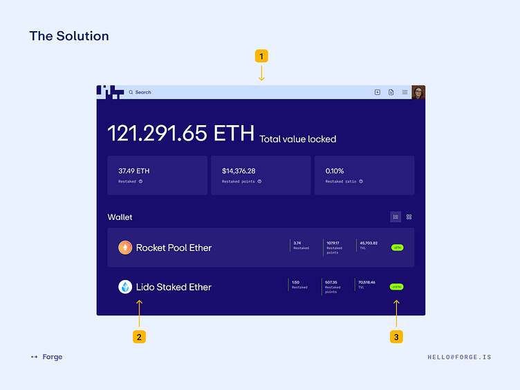
High contrast navigation bar that includes an enlarged search bar. Within in the system we needed to include both on-light and on-dark components to account for these areas.
Blown out typography within the list items. Search ability was a priority and we wanted to stray from the traditional small and dense tables you often see within products. This increase the scalability within these data sets. The user is able to switch between a list or card view.
Accent colors were used as backgrounds for the informative tags and dividers giving the product the punch of color it needed to draw attention to important areas but not overpower the entire view.
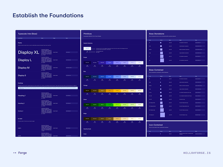
The team meticulously documented all foundational styles as design tokens creating both primitive and semantic sets with clear and holistic naming conventions. Foundation styles include color primitives, color semantic usage, typography, layout grids, border radius, border width, sizing, spacing, shadows, and other styles and effects.
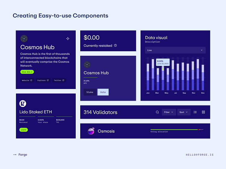
Components are aligned with code. We want to avoid users breaking these components so that product features can get build accurately and quickly so it’s a must that they are easy-to-use and flexible enough to account for future use cases. We solve for this by designing components atomically and are built together to create more complex components, much like LEGO blocks. We also consider the UX of the design panel within Figma’s UI.
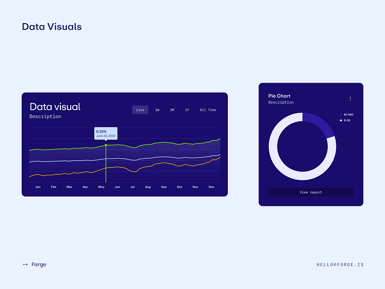
We created a data visual component that allows designers to adjust information on each axis, how many data points are being shows, and what type of data visual they might need. They can even adjust the hover data point height to hit exactly where it needs to without breaking the component. Of course, each breakpoint is also included.
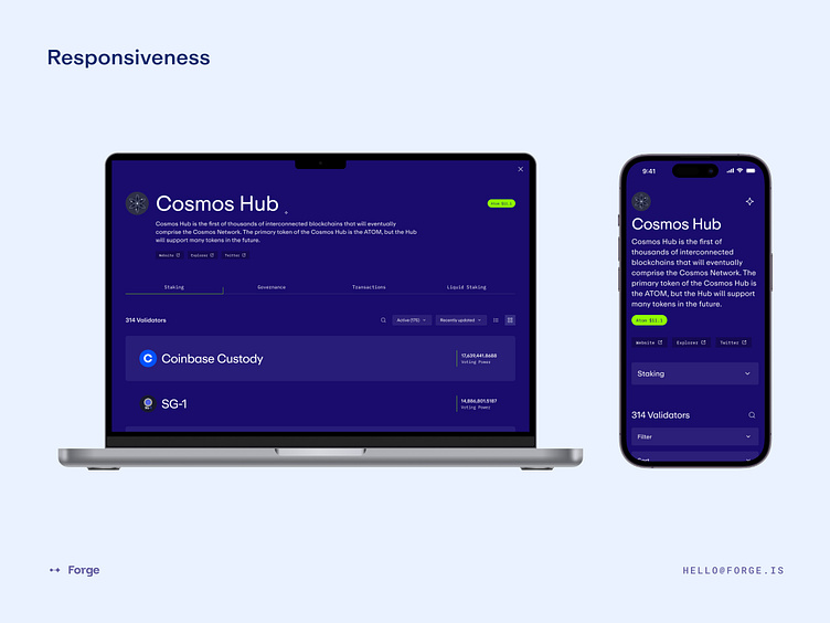
When using large typography it was important to showcase how it would translate from desktop down to mobile. Documenting a decrease in size at each breakpoint where needed. The team also needed to illustrated how other various components would collapse such as tabs turning into dropdown selections.
We are a team of experts who have sat in our clients’ seats—learning the ins and outs of exceptional design for companies of all sizes.
Email us: hello@forge.is
Become a part of Forge communities:


