John Lewis Redesigned: Boosting Conversions with Visual Clarity


Overview:
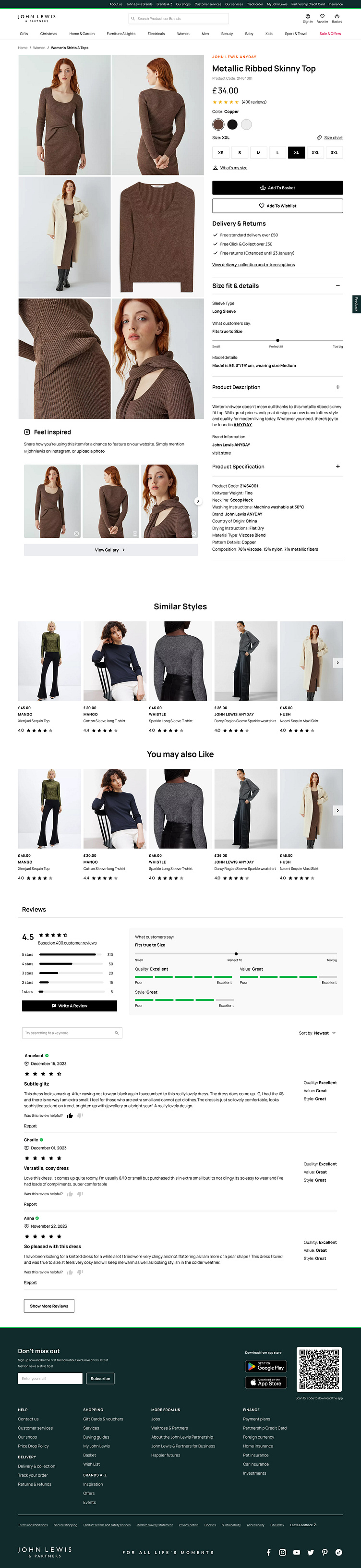
Imagine stepping into a cluttered department store, unsure where to find what you need. Frustrated, you leave empty-handed. That's exactly what many shoppers experienced on John Lewis' product detail pages.
High bounce rates and low conversion rates painted a clear picture: the existing design wasn't working.
Project Goal:
After all research and analysis from the existing interface and details
my Initial goal was:-
Reduced bounce rates and boosted conversions: "Reducing bounce rates and enhancing conversions became the focal point of my work. I orchestrated a seamless navigation experience where essential information took center stage, and strategic CTAs guided users effortlessly towards the 'Add to Basket' button
Enhanced visuals and UI overhaul: "Visual clutter fell away, replaced by an elegant ballet of product imagery and intuitive design. Each element found its place, whispering its story without ever shouting for attention."
Respecting user mental models: "Familiar steps danced alongside unexpected delights, each note in the user journey carefully considered to resonate with existing expectations."