Who's afraid...

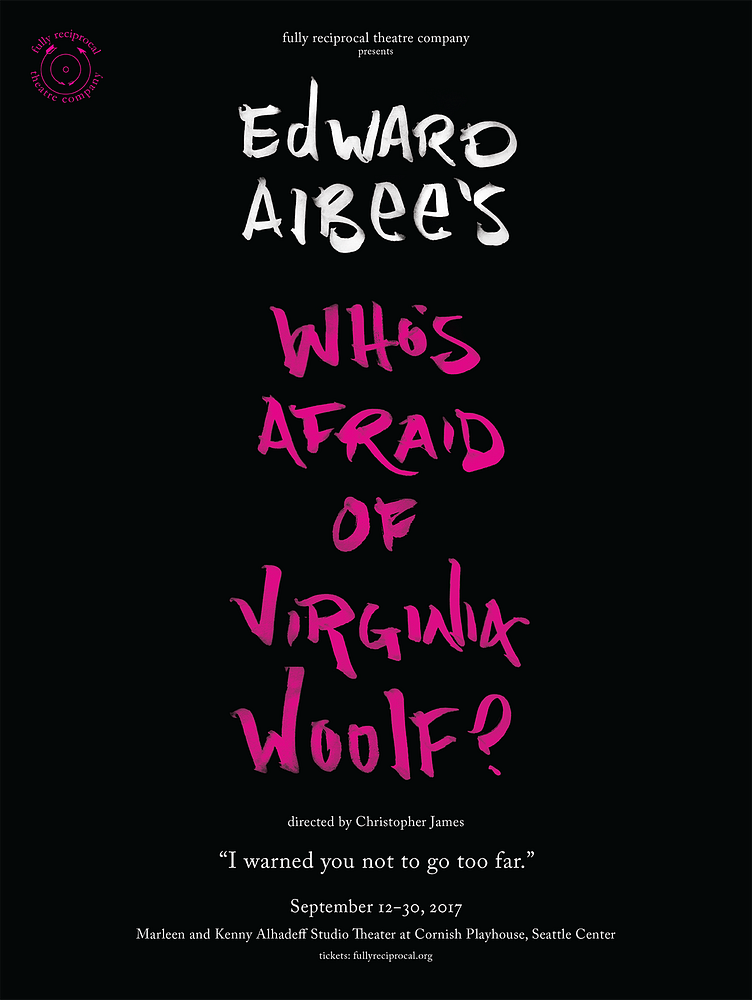
This is from a few years back, and in all honesty, was an alternate design — the final approved poster also had illustrations, but this to me was perfection. I love the minimalism, the menace only in the scrawl of the title and the understated "I warned you not to go too far."
The ad campaign did draw heavily from this concept, which was nice.


