Inspire - Process

Despite the fact I become a year older today, work calls. Currently working on a re-design for inspire a progressive digital studio based in the Netherlands. This is detailed iteration sketch with feedback of the client pointed out and thoughts of my own.
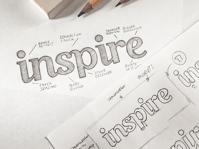
There are a few things I want to point out to you and ask for your thoughts on:
1. Does the “in” and “ir” could read as an “u”? (at certain sizes)
2. Decender of the “p” lower?
3. Is the “e” too rotated?
4. Terminal of the “r” too big?
5. What do you think of general spacing?
Also any other feedback on additional elements are very appreciated, or things you notice off-course.


