Visual identity for real estate developer


Challenge:
The brand faced a deficiency in strategic planning and creative guidance aimed at capturing its ideal consumer base. The previous logo lacked distinctiveness, blending in with the commonplace imagery associated with typical real estate developers, such as roofs and chimneys, lacking a unique personality.
What we did:
Your logo need not explicitly depict your product or service; consider iconic brands like Nike, which doesn't showcase a shoe, or Apple, which features, well, an apple. The objective is to delve into the company's rich history and extract deeper meaning. Through strategic utilization of negative space design, I skillfully fashioned a monogram intertwining elements to seamlessly embody both an "O" and an "I." To enhance visual interest, I introduced a strategically placed triangle to the right, forming a leaf and giving rise to an olive—a symbolic representation of Dalmatia and the coastal region.
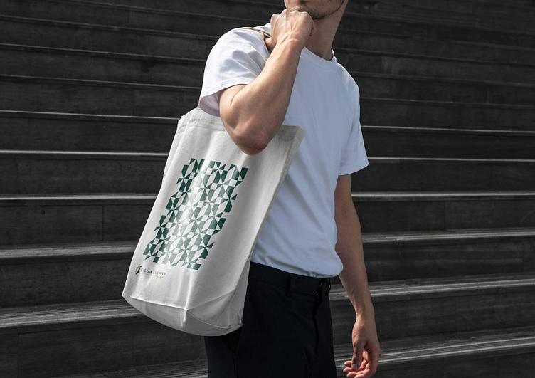
The outcome:
The brand has successfully cultivated a visually distinctive identity, introducing a unique color palette and brand pattern that sets it apart from competitors. This intentional design not only stands out but also encapsulates the brand's personality, creating a visual language that resonates specifically with a high-end clientele.