Spotr: Branding and Visual Identity ⚡️

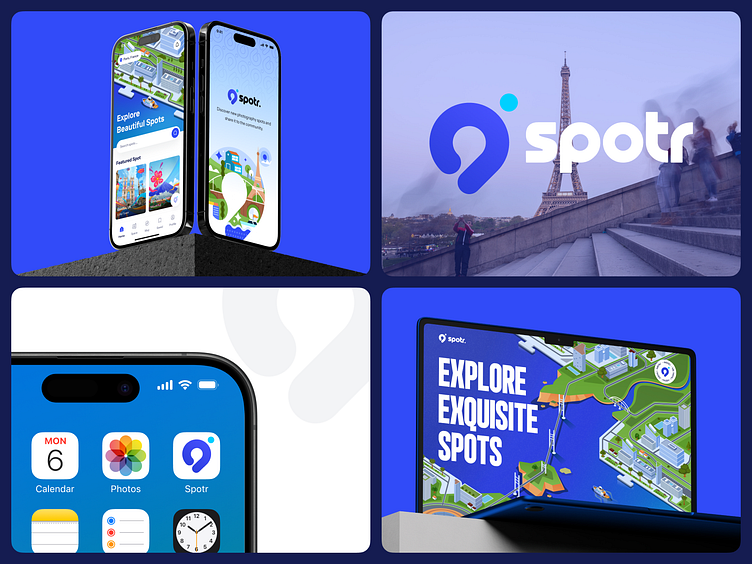
Spotr Mobile App. 📸
What is Spotr?
Spotr is a platform for seasoned or green photographers, as a guide to explore new places and discover new photography spots. It is also a community based platform, where photographers can add their own spot to the platform, or share their taken photos on their own gallery Space.
Logo & Branding 📍
Just as the name suggests — Spotr, it is designed to spot locations for photographic journeys for our users.The simple and modern logo design for Spotr, capturing its essence, is a mix between a pin location and a viewfinder from a camera.
The Spotr logo pattern can be used in a variety of forms, especially for visual identity.
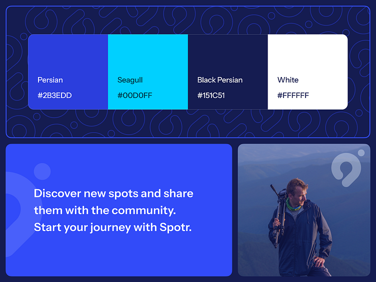
Color Palette 🖍️
We use a range of blue colors as the base and complimentary color to evoke trust in our users to start their journey. The blue seagull is then added to create contrast and vibrancy for the logo.
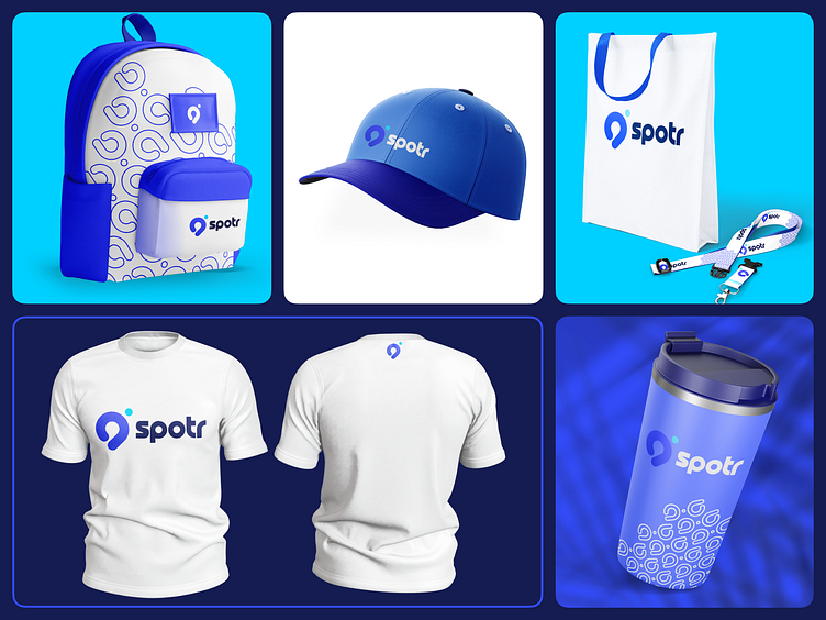
Visual Identity 👁️
We keep a consistent visual identity for Spotr through the use of its color palette and logo across a compilation of merch shown here. The use of logo patterns is prominent because they provide a recognizable and cohesive brand image across various items.
This unified visual language not only enhances brand recall but also fosters a sense of familiarity and trust among our users and audience.
Check out our Behance post for this project here!