Small Bets redesign

I've enjoyed the content Daniel and Louie have put out with Small Bets. That said, a strong business philosophy deserves a strong design presence to back it up.
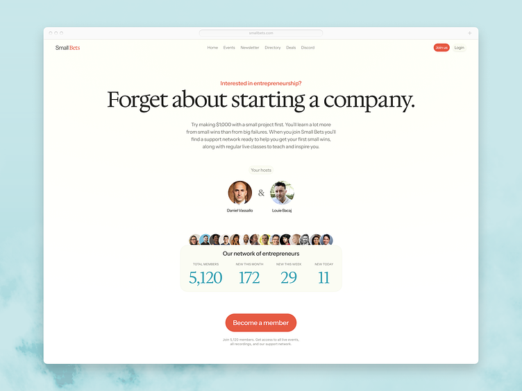
Daniel is a great copywriter, but his words didn't shine in the previous design. The emphasis of the header and subheader were inverted, reducing the impact of the provocation. Now, it's proper: "Interested in entrepreneurship, Forget about starting a company"
Beyond that, I aimed to highlight the community. Before it was siloed away in an odd sidebar widget. Now it's exposed as a selling point for the program. A last design detail was the centered layout. I found the sidebar layout felt less appropriate for the intent of this site, which is marketing. Genres should be respected unless there's a good reason not to.
As usual, Dribbble in compressing the image has drained all the color away. But just imagine that the image is rich and vibrant.
Check out the live site at https://smallbets.com/
Check the uncompressed redesign here: https://d2wx6rahy8yxgr.cloudfront.net/fee7f04d-5a3d-443d-9988-b81fdb0e3e72-Small-Bets-2-2x.png


