Backwoods Rebrand Case Study

Backwoods Brewing is a family-owned and operated brewery homegrown in the Pacific Northwest amidst the scenic Colombia River Gorge. They specialize in a wide-variety of curated brews and high quality food, and while their products are outstanding, their brand ID and packaging were feeling underwhelming.
With an ambitious desire to increase their distribution volume and increase their perceived value on the shelf, they reached out to help get their next chapter off on the right foot.
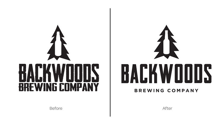
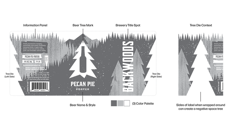
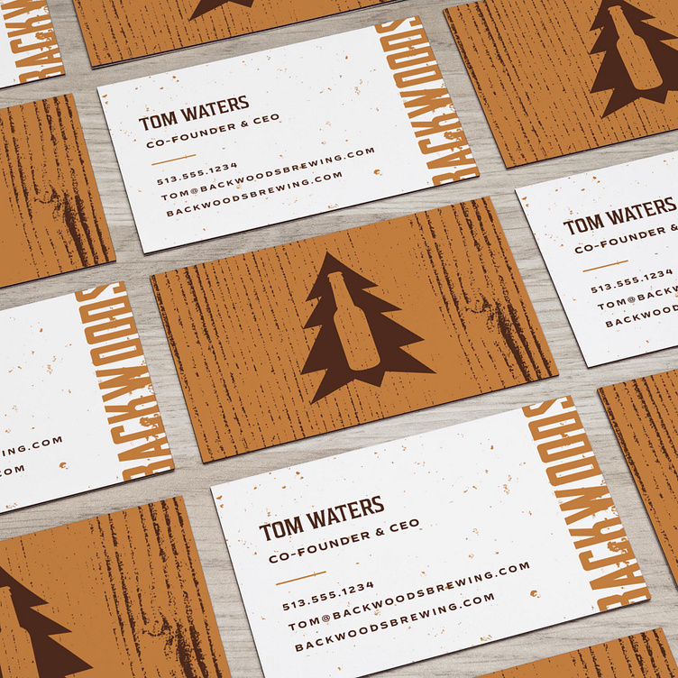
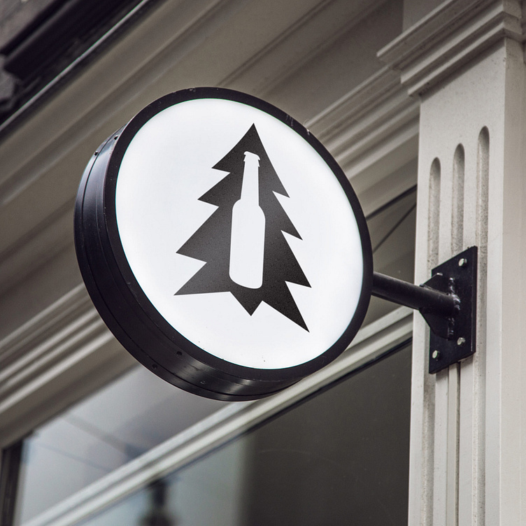
The Backwoods Beer Tree Mark is the foundational piece of the visual identity; the primary point of recognition.
With that amount of equity behind it, we knew we were going to have to restructure the overall design, helping to drive more impact on its own. Because of its awkward form, the original mark struggles with centering itself to any encompassing real estate, feeling off-balance and underwhelming.
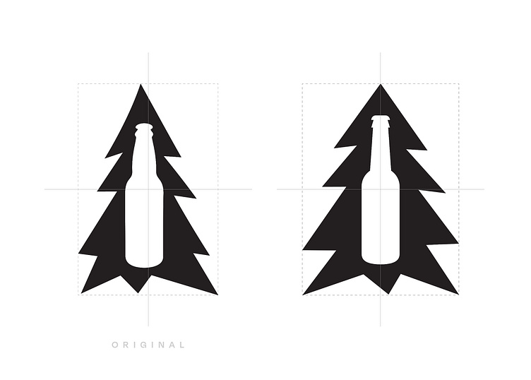
We started by recreating the design within a symmetrical grid to create a more calculated balance.
Adding a bit of width increases a heavier contrast, delivering more impact overall while also reading better at smaller scales.
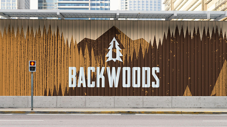
It maintains the heritage of the original mark while evolving it into the next stage of the brand’s chapter and truly becoming the centerpiece of the visual language.
Enter your text here...

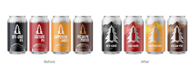
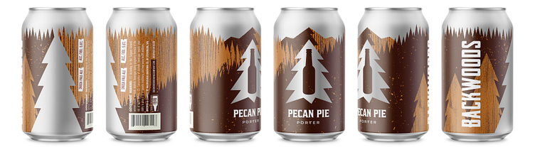
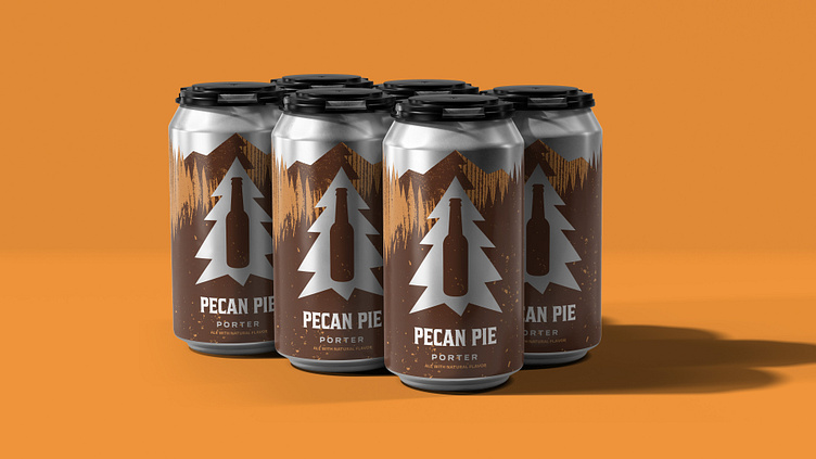
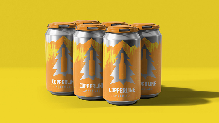
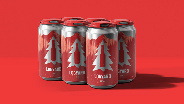
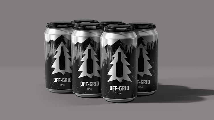
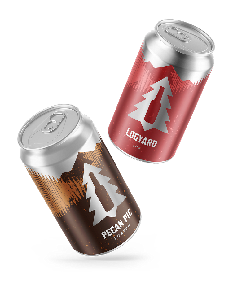
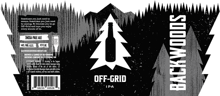
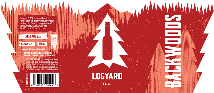
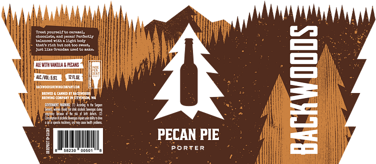
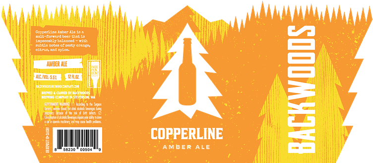
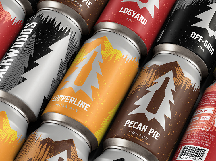
Enter your text here...Next, we brought the same mind of thinking to the flagship packaging system; creating a set template built around the Beer Tree Mark, evolving the old design into something more impactful.