Comulate Visual Identity

Comulate’s brand is anchored in a primary color palette that pairs a light and dark green — and a light and dark sand — with a gradient exudes energy and depth. A secondary palette of yellow and light blue establishes hierarchy throughout the brand, and the tertiary palette borrows from highlighter and pen hues to create eye-catching accents.
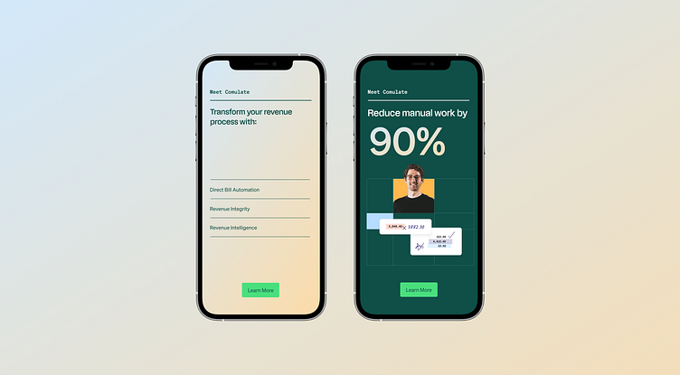
On the note of highlighters and pens, one of the most distinctive elements of visual language is markup graphic language. Drawing inspiration from the hand-penned checks, X’s, and other pen marks an accountant might use to mark up a sheet, the effect creates a human, empathetic touch that at once connects with Comulate’s target audience and communicates experience and trust.
Check out the full case study here.
--
Are you an early stage start-up, looking for a brand agency?
We would love to hear from you.
Email us: hello@odibrand.agency


