Ultimate Football League

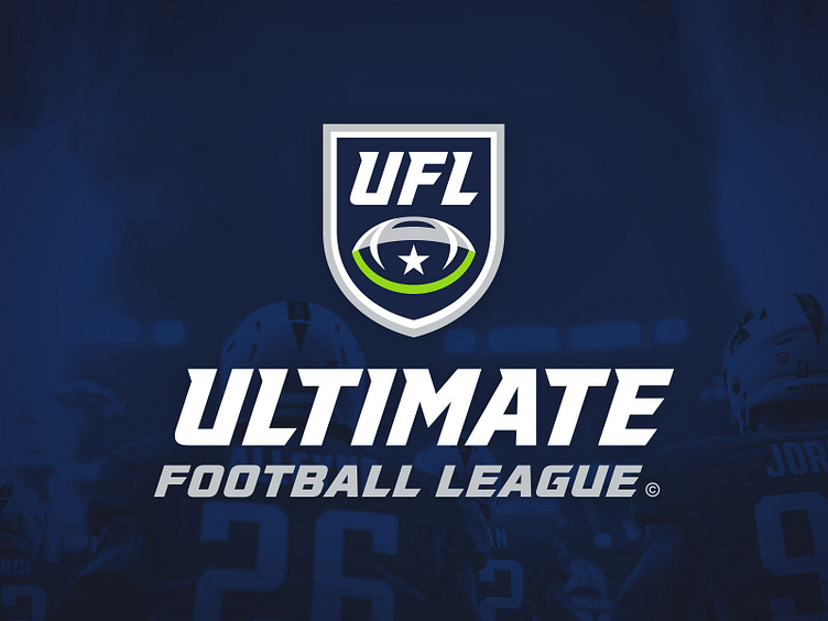
Refreshing the League Identity
Before visiting any of the 32 teams, we wanted to develop a complete logo system for the UFL as a league but all of its subsidiaries as well. This includes the two conference logos – The West and The East – the Ultimate Championship and the trophy mark, as well as event-based lockups for the playoffs using custom typography.
The Shield
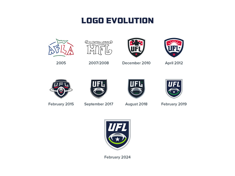
The league has had many different coats of paint since its inception. In the beginning, it was the "American Football League Association", which then pivoted to "My Football League". In 2010, when my 16-year-old self got ahold of Illustrator, the league turned vector and began to adopt a more traditional shield shape as the "Universal Football League". It wasn't until late 2017, a month after leaving my in-house role to pursue ZDS, that the league was named the "Ultimate Football League".
The abstract ball elements of the shield from 2017 onwards were meant to depict the game – the top of the ball was the stadium, and the bottom of the ball was the field. Over time, the story became lost and unclear. The 2019 evolution simplified the ball and moved the star to the center of it, representing myself being in the center of the game. After 5 years, we took this version and gave it more conviction – reworking the shapes and giving it a beefier footprint. The star is larger and more prominent and the curves were smoothed throughout to create balance.

The Typography
For the typography, we began to incorporate a tweaked version of VT Redzone Reg Oblique (part of a larger redesign by VarsityType that is currently a work in progress). This version borrows elements from the star, specifically the italic angle, the shape of the spur serif, and the style of the terminals. The custom typography is implemented throughout the identity.
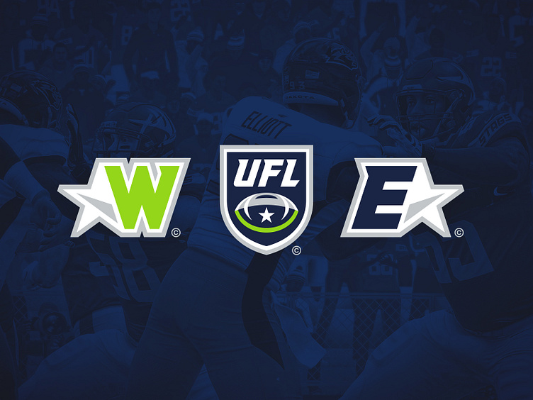
Conference Logos
The league is divided in to 2 conferences – The West and The East. The mark for each conference is built using an interlocking of a "W" or "E" hugging the contour of the shape. The letterforms borrow similar angles from the star, and the inner shadow points either westward or eastward.

Ultimate Championship Logos
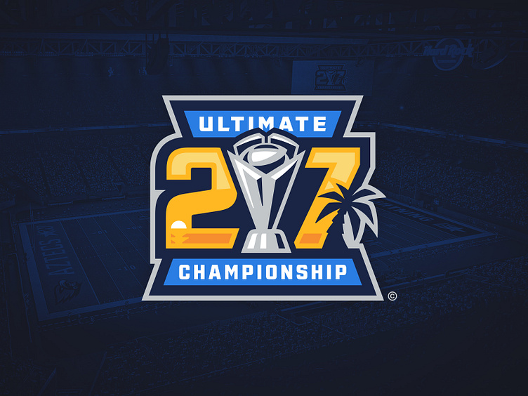
Every season, after 24 weeks of play, the UFL culminates with the Ultimate Championship game. And the winning team need a trophy, so we designed one. It features the ball from the UFL shield nested in four prongs that represent the four divisions in each conference. The angle of these prongs again shares a similar angle to the star. These shared elements allow all of the pieces to lock up nicely.
When it comes to championship logos of the major American leagues, it doesn't solely represent the event – it captures a cultural moment in time. Despite this league being completely fictional, we wanted to make sure every championship game logo told its own story but was constructed in a way that was consistently and recognizably "the UFL". The trophy is front and center with the numbers flanked on either size with "Ultimate" and "Championship" hugging the top and bottom.
Last season's UCG was played in the UFL Florida Sharks' stadium (fictionally located in Tampa but adopting the sourced vessel of Hard Rock Stadium) and the logo borrows colors from the team as well as elements from around the area. You can actually watch this game in full over on our YouTube channel.