Kitchen Kneads Branding

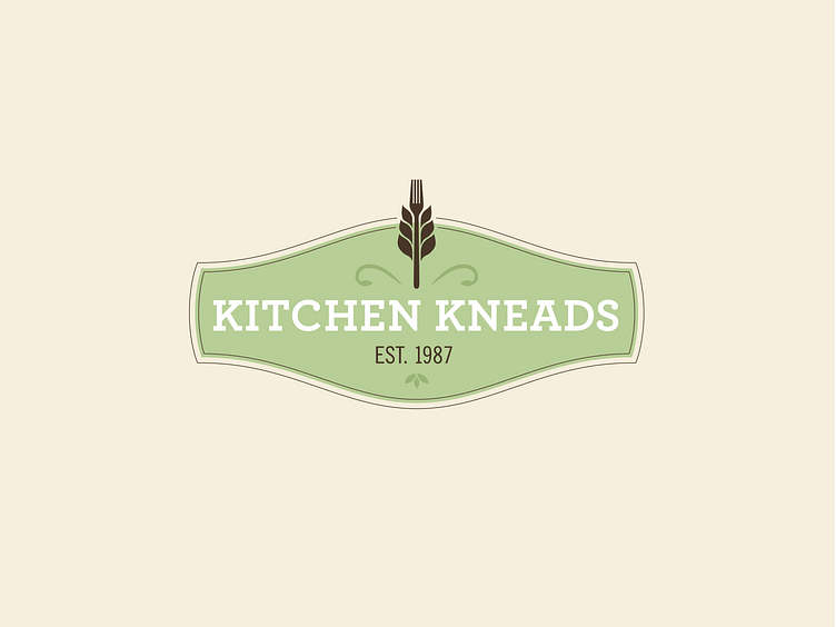

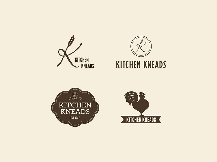
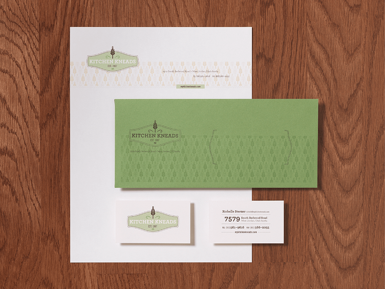
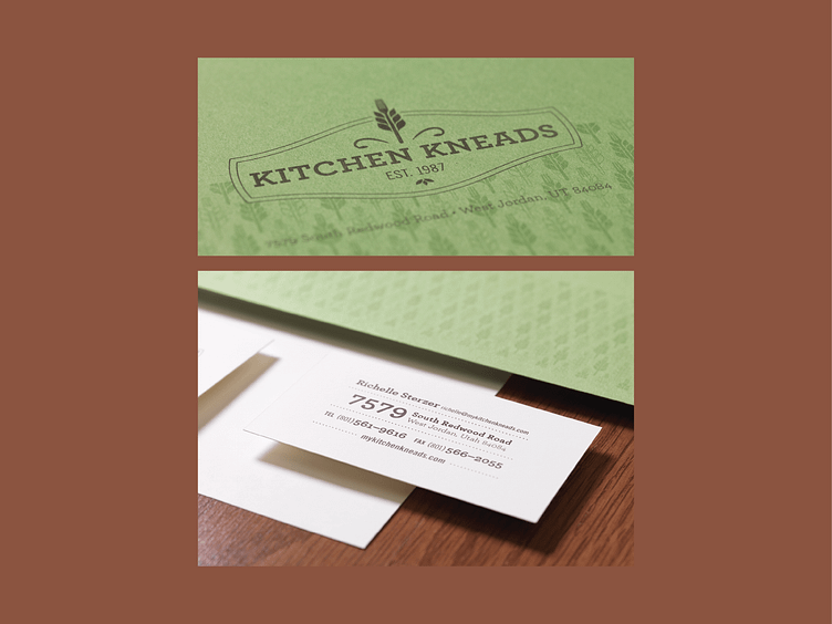

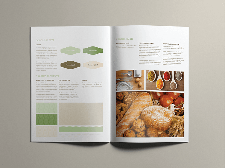
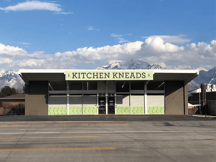
Kitchen Kneads was looking for that secret ingredient—they needed a way to reinvigorate their quaint healthy food and kitchen supply store, yet retain the nostalgic feel of a local fruit stand. With a pinch of vintage, a dash of contemporary, and a whole lot of great creative, the growing wheat-fork icon sprouted onto collateral, and throughout the rest of their wholesome brand.
Full case study on our website. kyleharrisdesign.com
Have a project in mind? Let's work together!
Follow me on Instagram.


