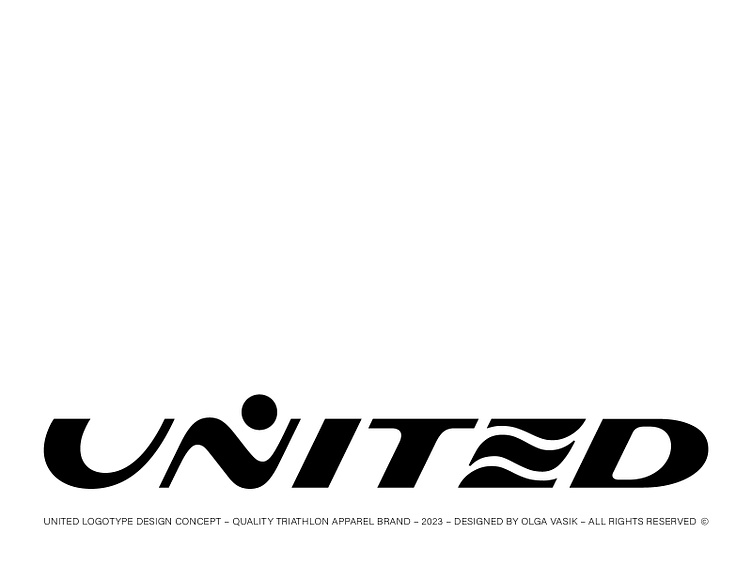
United logotype
One of the concepts for the united logotype I’ve been working last year. United is a quality triathlon apparel brand. The idea was to incorporate triathlon disciplines pictograms into letterforms. So the “U” stands for the wheel and cycling, “N” as a runner figure and “E” as a wave.
More by Olga Vasik View profile
Like


