UX/UI for Gaming - An Overwatch 2 Study


About the Project
During a class on UX/UI to practice the process, I did a study of the game Overwatch 2. I wanted to try to modify and improve some aspects and not just copy it. This project showcases critical design thinking throughout the UX/UI journey of creating a game.
My Roles & Responsibilities
Restructure Overwatch 2 by working through the UX/UI process.
Length Of The Project
Jan 2024-Feb 2024
Challenges
Bridge the gap between game developers' and players' experience.
Understanding Player's Point of View and Emotions throughout the game experience
Trying to find improvement on an award-winning established game
Creating a testing environment to gain proper feedback.
Player Journey
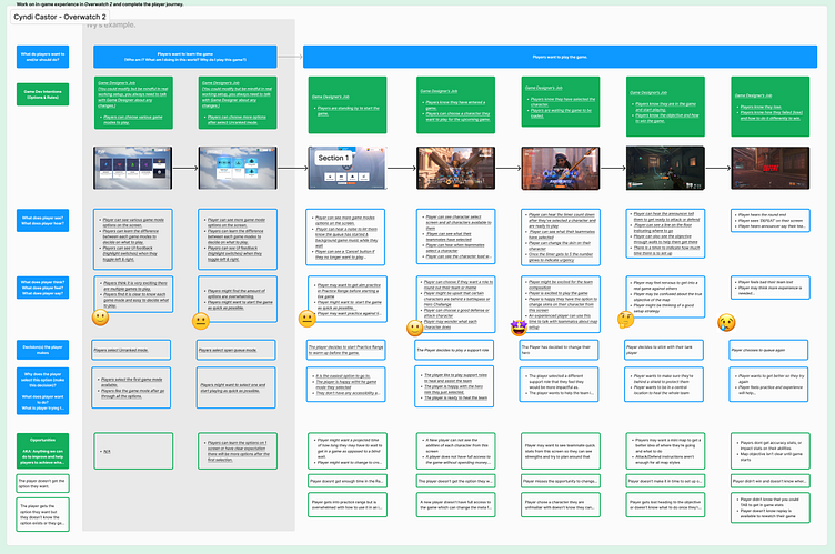
Created the Player Journey. Added Emojis to represent the player emotions at a given point in the journey. (what does the player see/hear/think/say/do?)
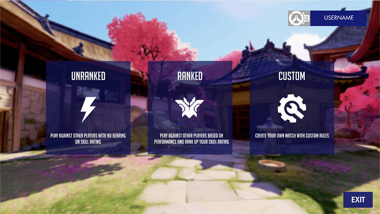
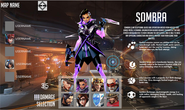
Here I was looking for problems a new user might have. I noticed that the current “Character Select” screen wasn’t very user friendly. Instead of user abilities being visible, you’d have to press a specific key to have them pop up, and the key wasn’t listed on the screen - you just had to know which key to press.
Paper Prototype & Flow Chart
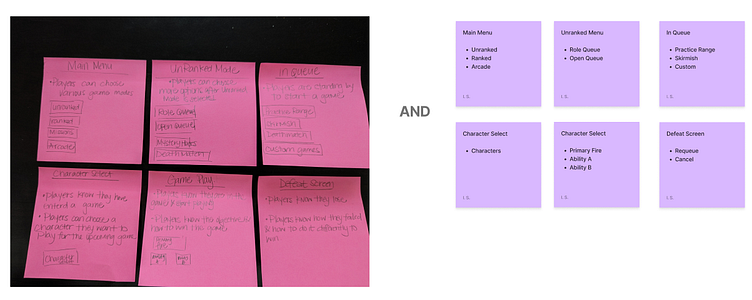
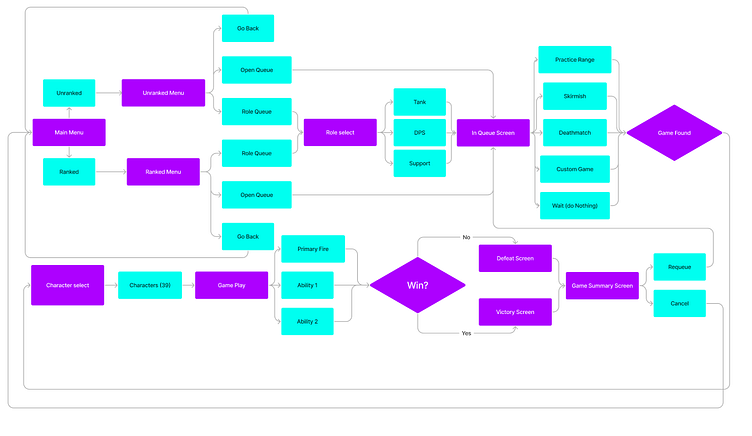
Using the prompts from the Player Journey, I categorized and translated them into prototype screens, which were then used to make a flowchart fitting..
Wireframe, Iterations, and Testing sheet


From the flow chart I created a working wireframe prototype to test the flow and usability.
I created a worksheet to give to users to get feedback. I wanted to get a layout of the character select screen and how that would look and work in the Overwatch environment
.After reading feedback, I made changes to button placement and text visibility
UI Moodboard

With Overwatch being an established and award winning game, I wanted to make sure I kept visuals similar, while keeping to the spirit of an already successful game.
UI Styleguide & Mockups
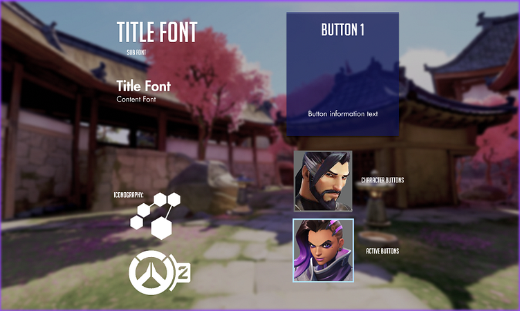
I used the existing Overwatch fonts and simple iconography. I created buttons and added an outline to active selections.
I laid out the style of everything I created in a styleguide so that anyone designing in game could follow.
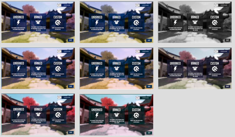
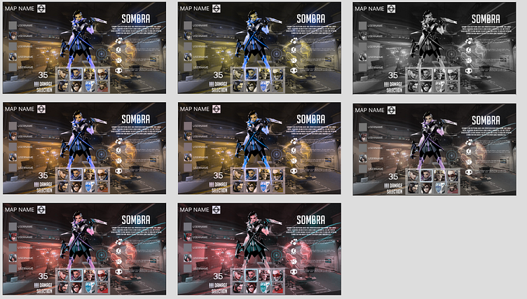
These are the final versions with enhanced visibility. I adjusted the Overwatch artwork in Photoshop to improve contrast, between light and dark areas, ensuring colors such as red and blue are distinct from one another. This was done to pass colorblind tests (below) by creating a clearer difference in color values, making the content more accessible.
Colorblind Testing
Outcomes
Throughout this project, I’ve been working with a complete workflow of UX/UI design. From identifying user pain points and existing UI to prototyping, wireframing and user testing. Further, I have learned how to complete a wireframe in figma, as well as create a working protoype for testing.
Post-Mortem
Some things I take with me into the future are the importance of specificity in asking for feedback, working on visibility for easier accessibility to visually impaired users.


