Vercel Ship redesign


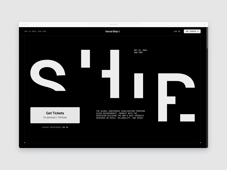
The new Vercel conference site attempted for a technical theme, by leaning on capitalized Geist lettering. It falls flat. The cut-off type combined with the disintegrating letterforms is conceptually overloaded, not to mention a ham-fisted attempt at the cut off cliche. Simplifying to one form of reduction is appropriate. I'm not entirely sure why the disintegration concept even makes sense, nor does it look particularly impressive. But in a redesign, you work with what you're given lest you go so off-script that you're not improving so much as replacing. Regardless, if you're going to show off your bespoke corporate typeface Geist, actually show it off. Don't obscure it to the point that no one can even tell what it is anymore. Or use all caps, as they have, which have very little distinction.
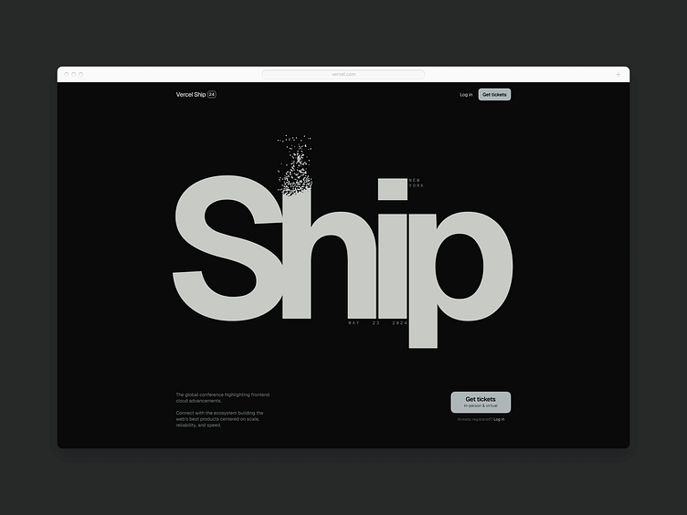
In my redesign, it was important to play with more coherent alignments rather than random rectangles for anchoring—such as the lower right in their design, duplicated dates and locations, or random centering combined with asymmetry as they have it, which made no sense.
In general, Vercel suffers from an over-reliance on black and white, and there's not enough courage to take that to the fullest extent and play with contrast beyond that which is already inherent. It's just a form of lazy simplification in most executed cases. It's a tough challenge of course, but one no one forces upon a designer. I've chosen to add some subtle hints of color here to at least give it a flavor. Lastly, the elements such as buttons needed to be harmoniously sized rather than ballooned out.
See the live site here: https://vercel.com/ship