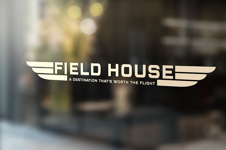
Field House - Restaurant Logo & Branding

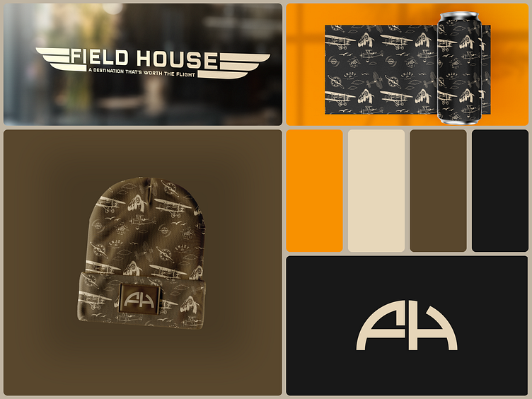
The “FH” mark isn’t just letters; it’s a fusion of imagination and heritage, designed to mirror the original structure of a Field House/Hangar. This concept was sparked by my proposal to Field House, a local restaurant whose story took an unexpected turn, closing its doors shortly after our paths almost crossed. It’s a bittersweet reminder of the pivotal role branding plays in a business’s journey. 🏚️➡️
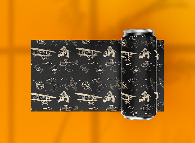
🌟Diving deeper, each detail in the logo tells a story - the beer can pattern is inspired by the iconic Wright Flyer, a tribute to Wright Pat Air Force Base and the visionary Wright brothers. It’s my way of celebrating our hometown’s legacy and its impact on aviation history. ✈️
Though Field House and I never officially collaborated, this project is a testament to the power of creativity and the possibilities that lie in the “what-ifs.” It’s about paying homage, pushing boundaries, and embracing the stories that shape us.