Climb Hire Rebrand + Case Study

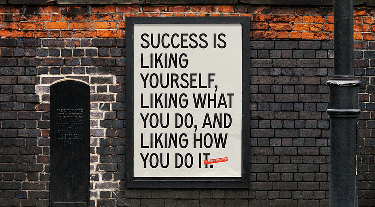
Carrie is a typeface that is full of history. Designed by Tré Seals of Vocal Type, the typeface is named for notable suffrage leader Carrie Chapman Catt and is based on protest signage from the suffragette movement, boldly speaking to Climb Hire’s dedication to lifting up others. We carried the handmade protest signage direction further by also introducing a rolled-ink texture and dynamic typography to the visual system.
The cornerstone of the Climb Hire visual identity is the outspoken type treatment of bold, tilted headlines that bleed off the edge. What better way to represent breaking through and rising up than literally breaking through and rising up through composition? The imperfect nature of this treatment illustrates a powerful, hands-on feel that resonates with our audience of Climbers.
To complement Carrie, Diatype Semi-Mono captures the same grassroots feelings and pairs well with Carrie’s retro flair. Monospace fonts exist for the express purpose of typewriters and computer systems, so this choice nods to the tech landscape many Climbers aspire to. For extra cohesion, Diatype is also used for the logotype.
Click here to view the full case study.
--
Are you an early stage start-up, looking for a brand agency?
We would love to hear from you.
Email us: hello@odibrand.agency


