LANDR Samples 2.0

Revamping one of LANDR's most popular products by improving discoverability and reducing friction, step by step.
Samples are audio files that many musicians use regularly to create beats, find inspiration or complete a track. At LANDR, in 2019, we launched our own samples marketplace, a curated library of samples from third-party providers, supported by AI-led tools to help users search and preview samples in context (screenshot below). After about 3 years of collecting data and feedback, and watching the platform grow, we decided it was time to tackle the biggest problems users and visitors were facing. By doing so, we hoped to increase user interactions throughout the app, and the number of premium subscriptions.

Challenges
The first step was to understand how we could improve the experience of the visitors of the app. The product manager who orchestrated the project is a music creator himself, so he had strong opinions on the matter, but to get the full story, the Analytics team provided user data from Amplitude, and the Product Marketing team ran a survey. My team (Product Design) also looked at a bunch of Hotjar recordings and heatmaps. Here are some of the main problems that were presented to me:
Unenticing homepage
The performance of the homepage of the app, which was originally called "Discover", was underwhelming. Users didn't interact much with the tabs, so a lot of content wasn't seen. Visually, using a long list of carousels to display packs and collections made it look pretty monotonous. Visitors preferred to go to the "Browse" page to find what they're looking for, making this page a poor introduction to the product.
Tedious navigation
One common action a user would do is to listen to a pack preview or a single sample, then go to the full pack or collection to listen to more samples. According to the feedback that we got, this action was annoying, because users would have to go back-and-forth between pages just to listen to a little bit more of the content. Additionally, a user that wanted to subscribe and download a sample would have to go through a multitude of pages to do so, which also led to more frustration and confusion.

Inadequate search tools
Traditionally, a samples website would have a browse page where people can simply search through the full catalog using filters and LANDR was no different. Looking at data, recordings and heatmaps, we noticed that users preferred to enter simple keywords in our basic search field, even though we had put more emphasis on the filters dropdown menus. It was faster and more natural to type in "kicks" than to find the right filter. We also showed "top packs" and we realized that it's not necessarily what users would be looking for here.
Approach
Since we wanted to have an impact as soon as possible, we had to focus our efforts on those problems in a way that wouldn't require months of coding. We had to plan different phases to follow the company's roadmap and to allocate development resources efficiently. Many parts of the app would have to stay the same for launch, so we'd have to make sure that any changes wouldn't cause new problems in the user experience.

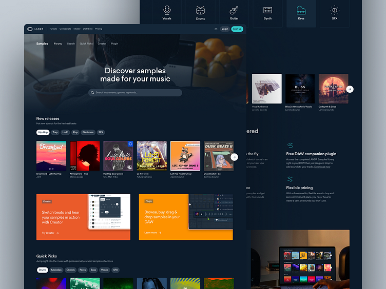
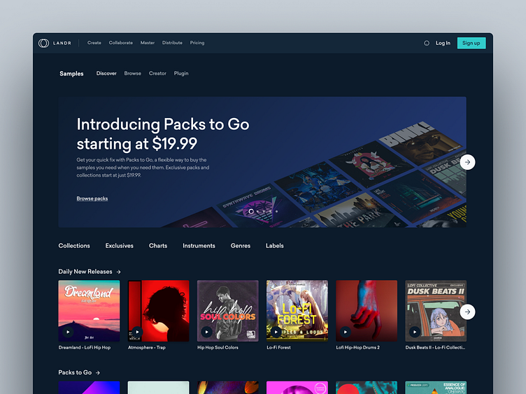
Diverse & attractive storefront
The homepage of the site is supposed to act as the storefront. With the redesign, our goal was to showcase any content that could spark inspiration, to facilitate search and also to give some information on what LANDR offers for those who are interested. After exploring many ideas, we came up with this:
Personalized hero: Guest visitors and returning users would see different content at the top of the page. We also gave more emphasis to our search tool (more details further down).
Better carousels: Instead of having tons of carousels, we grouped them in broader categories and add tabs to let users filter quickly.
Charts: Some people like to see what's "hot" and it can be a good way for them to get started with creation.
Instruments: Start a search for a specific instrument with just a simple click.
Cross-selling: LANDR is more than just samples and we thought it would be a good opportunity to talk about how other products can help them create.

Efficient & engaging navigation
We had to figure out a way to give the users a better preview of each pack or collection, so they don't have to constantly navigate back-and-forth between pages... We iterated on multiple solutions, mostly around the idea of having a preview panel/card that would let the users get more information and listen to some samples from the pack/collection. We ended up with 2 prototypes that we tested with users, then we found our winner and improved the design thanks to the feedback that we got. It was also a good opportunity to validate our new homepage layout.

Simple, yet powerful search tools
One thing we knew for sure is that we had to put the search field forward and improve its UX. Also, some users would still want a way to see what's available and how we categorize samples. After weeks of exploration and validation, we decided to go with this solution:
Focus on the search: The search field is what most users are looking for and is what they'll see first. It's simple, but it works.
Autocomplete & suggestions: Not only we decided to give more emphasis on the search, but we also wanted to make it faster and smarter.
Advanced filters: By default, the filters sliding panel would be closed, but could be opened at all time if that's what the user would prefer. They're also easier to scan and understand compared to the original dropdown menus.
Fully responsive: This might be obvious, but we had to make sure that the right information would be shown whatever the size of the screen and to not lose the filters panel.
Results
Overall, Samples 2.0 was a pretty successful project. If you want to see how it looks, I suggest you visit the website. In terms of numbers, we were pleased as well. Obviously, there were other contributing factors, but the redesign played a big part. After about 6 months, we got:
40% increase in user engagement
9% increase in samples purchases
2x more signups
I'm really proud of what we accomplished. Everyone did a fantastic job and I would give a special kudo to Jonathan Dumas, the product designer from my team who worked on this project. It was his first big project at LANDR and he did really well!
Learnings
To me, the biggest learning that I got from this project was the power of a small, multidisciplinary, tactical team. Every week, the product manager, a front-end developer, a product designer and I met to discuss the latest problems or learnings that we had found. It really felt like we were progressing in the right direction continually, like we were even more efficient with our time. We developed a really enjoyable chemistry. Reviewing my work with developers has been part of my process for a long time, but this felt more like we were solving problems together as team, and not one department presenting their work to another one to get their approval.


