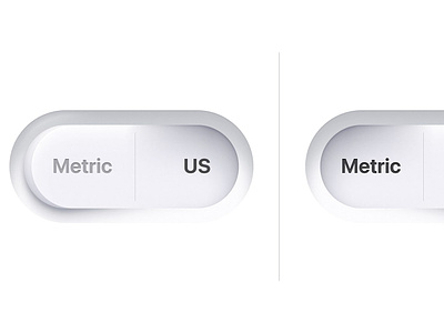
Rudberg toggle

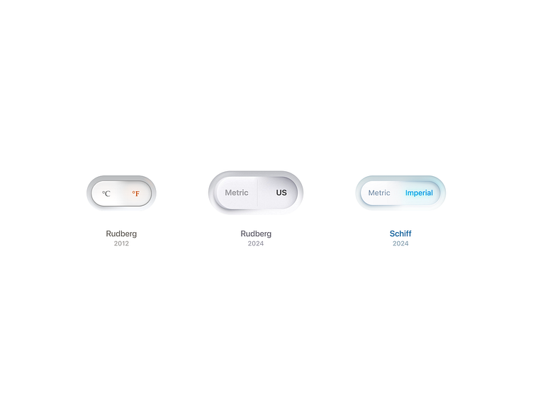
In the spirit of the redesign homage I drew to Claudio Guglieri's switch a few months back, this time I've redesigned Max Rudberg's toggle. When Max first drew this sort of dimensional toggle for Veggie Meals in 2012, and later on his portfolio site, for iOS 7, for Veggie Weekend, and now for Plantry in 2024, I always took note. Rudberg recently wrote a nostalgic blog post about these buttons, and it brought me back to those times following along his journey in making inspiring UI elements—which compelled me to try my hand at synthesizing what a contemporary version of these elements might look like.
I am quite partial to Rudberg’s 2012 toggle. It had a beautiful and subtle glows on the typography, smooth shadows, a reflection of the glow from the type that is totally non-intuitive but just hits the spot. His 2024 design feels like a step back in many respects and I aimed to restore the excellence of the original in my design.
In the original, there was this curved angle that shows the toggle wasn’t a single flat plane but two contiguous planes connected by a curved angle—which felt much more subtle. I haven’t quite achieved what Rudberg did in this respect in his original, but I’ve gotten closer. Rudberg’s 2024 design also has an unnecessary divider line that has too little padding on the top and bottom. The sizing of the toggle itself feels quite large and similarly has disproportionate padding on the text from top to bottom compared to the sides. The “Metric” vs. “US” labels feel unbalanced, which I’ve fixed by changing “US” to “Imperial”. The shadow on the outside left is passable, but doesn’t match the depth which the toggle rises from the inset surface. The inset shadow on the right appears to be coming from a 0º angle rather than the 45º on the lower right, while they should maintain the same angle as the absence of light should remain consistent regardless of where it sits. The inner shading on the text in his 2024 design feels heavy-handed, which I’ve drawn down in my design. The lip of the toggle exposed on the left doesn’t really make sense. If you are going to show lip, you need to consider perspective, which his curves don’t appear to, possibly to maintain the contour and mask that the lip is contained in. Either way, if the toggle was say 20-24px tall, this would be acceptable, but at 96px high, more detail in depth needs to be considered. I’ve opted to avoid the problem of the lip entirely by reverting back to Rudberg’s original approach.
Having said all this, Max is one of the few powerhouse UI designers remaining on the planet, and deserves recognition for continuing on this tradition as he has for more than a decade of play and exploration.