Orange Music Branding

Case Study: Branding for Orange Music
Introduction
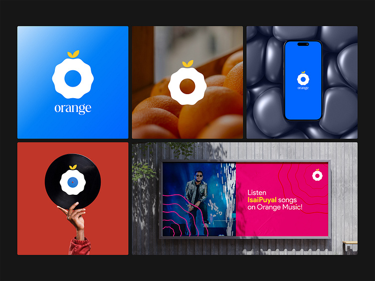
Orange Music, a burgeoning free music app, has redefined the auditory experience for its young and dynamic audience through its innovative and visually captivating branding. The cornerstone of Orange Music's branding strategy is its distinctive logo, a creative amalgamation of an orange fruit and a gramophone cassette. This case study explores the comprehensive branding approach undertaken for Orange Music, including its logo design, color palette, typography, and additional marketing assets.
Challenge
The primary challenge was to visually encapsulate the essence of Orange Music in a way that appeals to the young target demographic, distinguished in a crowded market, and communicated the brand's unique offering: a fresh, vibrant, and accessible music experience. The branding needed to be versatile enough for digital and physical mediums while remaining instantly recognizable and memorable.
Solution
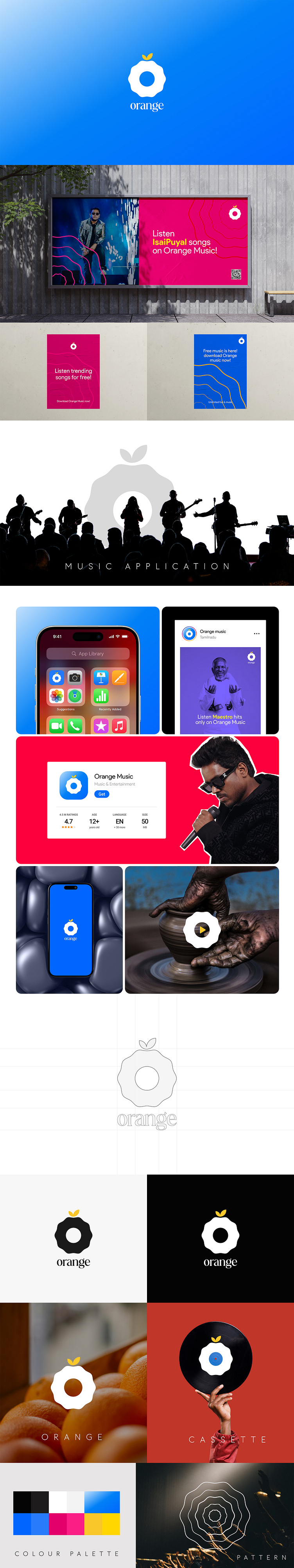
Logo Design: The Orange Music logo is a creative blend of an orange fruit and a gramophone cassette, symbolizing the fusion of natural freshness with vintage musical nostalgia. This design not only captures the brand's essence but also appeals to a broad audience by evoking a sense of warmth, creativity, and musical heritage.
Color Palette: The color scheme is rooted in vibrant and attractive hues, dominated by shades of orange, complemented by contrasting colors to evoke energy, enthusiasm, and the vibrancy of music. This choice ensures high visibility across various platforms and resonates with the youthful energy of the target demographic.
Typography: The typography was carefully selected to complement the logo and overall brand identity. A modern, sans-serif font provides readability and a contemporary feel, reflecting the app's ease of use and the brand's forward-thinking ethos.
Unique Pattern: A unique pattern representing sound waves was developed to enhance brand identity further. This pattern is used across various branding materials to add depth and consistency, symbolizing the essence of music itself - vibrancy, movement, and energy.
Marketing Assets:
App Store Mockups: Designed to showcase the app's features in a visually appealing manner, highlighting the ease of navigation and the wide selection of music available.
Instagram Posters: Customized posters for Instagram were created to engage the audience with visually appealing graphics and messages that resonate with the young audience's lifestyle and preferences.
Branding Pattern Usage: The unique sound wave pattern was integrated into backgrounds, merchandise, and digital platforms, serving as a subtle yet powerful brand reminder.
Result
The branding strategy for Orange Music has been met with enthusiasm and positive feedback from its target audience. The distinct logo and visual identity have significantly contributed to brand recognition, setting Orange Music apart in the competitive music streaming landscape. Engagement levels on social media platforms, especially Instagram, have seen a notable increase, indicating a strong connection with the brand's visual identity. Additionally, the consistency across various marketing materials has reinforced the brand's identity, making Orange Music a go-to music app for its young, vibrant audience.
Conclusion
The comprehensive branding approach adopted for Orange Music illustrates the power of visual identity in establishing and nurturing a brand's connection with its audience. By thoughtfully integrating elements that resonate with its target demographic, Orange Music has successfully carved a niche for itself in the music streaming industry, proving that a well-executed brand strategy can lead to substantial market impact and brand loyalty.


