ClayMagic Logo mark

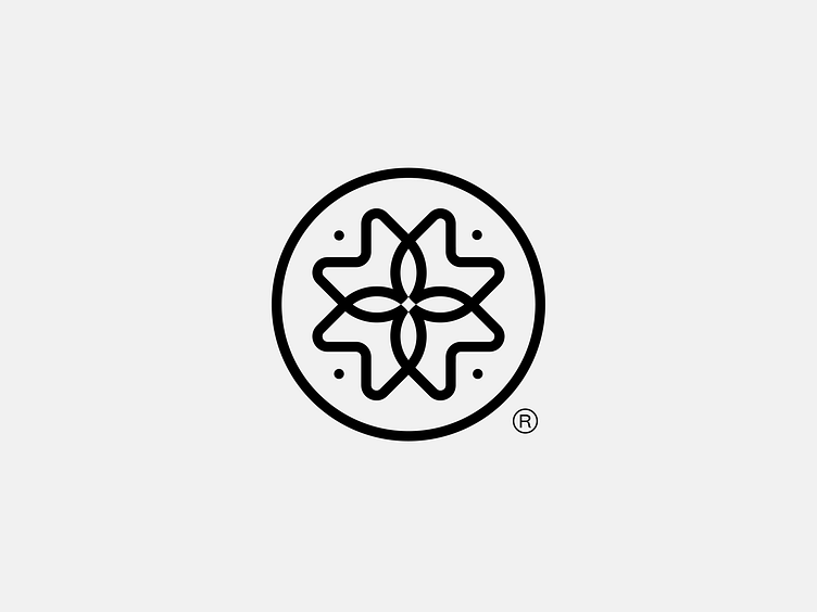
Logo mark preview of a recent project we did for a clay therapy workshop.
The logo represents community, growth, repetition.
The client wanted to somehow have the baltic feel to it as well, since the workshops are hosted in Lithuania.
Do you think we succeeded in this brief?
If you're interested in working with us or just want to say hello, please contact us at: design@lipcik.com


