04/32 – Rochester Pioneers

Welcome to Boomtown
Rounding out the division for #TheUFLProject – the Rochester Pioneers.
A historical underperformer, this team has yet to make the playoffs in 27 seasons. Their misfortune had allowed them to accumulate some draft picks – picking up a franchise QB with the first pick in Season 24 and some offensive playmakers in the drafts thereafter, earning them 4-0 and 5-0 starts in the past two seasons. The Pioneers play in the Metropolitan Division of the East Conference.


Visual Direction
This team was originally named the "New York Pioneers" before moving upstate not long after the league began to step out of the shadow of bigger brother in black and gold. Rochester, NY is known for being one of the first boomtowns in the U.S. – the city saw large growth in manufacturing due to its access to waterways in addition to being the birthplace of many notable companies. It became a fitting home for the franchise.
With a name tied to local historical significance, the identity was painted with a traditionally-styled brush. The city is home to many prestigious institutions and its skyline is made up of robust architecture and these two aspects led to a direction with many strong lines and curves incorporated throughout the design.
Execution
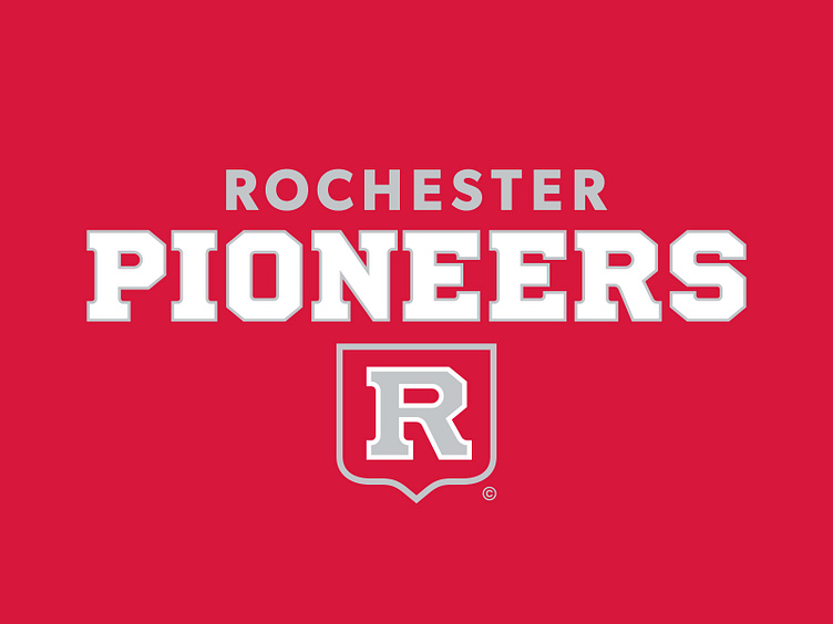
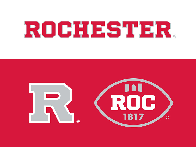
The primary logo for the Pioneers incorporates a sturdy block "R" chiseled inside of a red shield container. The curved point at the bottom of the shield is pulled from the city flag and doubled as a profile of an open book, a nod to the renowned educational institutions in the area.
The secondary logo depicts the Mercury Statue – a landmark of downtown Rochester that was created in 1881. Mercury, the Roman god of commerce, was placed atop Kimball Tobacco Company as a good omen and now rests on the Aqueduct Building a block north of its original home.
In addition to a partial mark that pulls the "R" out of its container, the Pioneers have a tertiary badge that they wear on the left chest of their uniforms. The badge illustrates a football with "ROC" across the middle and the city's incorporation year underneath. The laces double as the city skyline – the Xerox Tower, the Legacy Tower, and the Metropolitan are depicted with the Frederick Douglass-Susan B. Anthony Bridge in negative space.
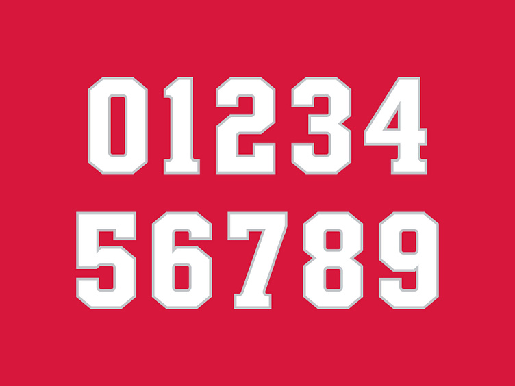
The team's wordmark and number set are built from a custom typeface that embodies the many curves and angles seen sprinkled across the city's architecture and expresses it in a bracketed slab serif.
Laying the Foundation
With a strengthened brand identity that reflects the city it calls home, it won't be long before the Rochester Pioneers finally make their postseason debut in a look that lasts.
Football Helmet Mockup by SportsTemplates
____________________


