Dark Vs Light


Hey,
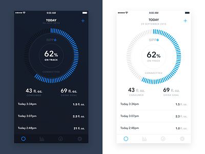
so this is the homepage of the Sippo Smart Cup iOS app.
The big blue circle that feels up is your daily goal and underneath are your 3 latest water consumptions. So there is no scroll and you can find more data about your water consumption on the "Drink Log"screen.
The screens I am uploading were part of A/B testing, where we tested a darker and a lighter version of the app. The end result showed that the light version performed a lot better, so we decided to go with the light version.
But let me know which one would you prefer?


