Bento Scape | Lighthouse | Custom Type

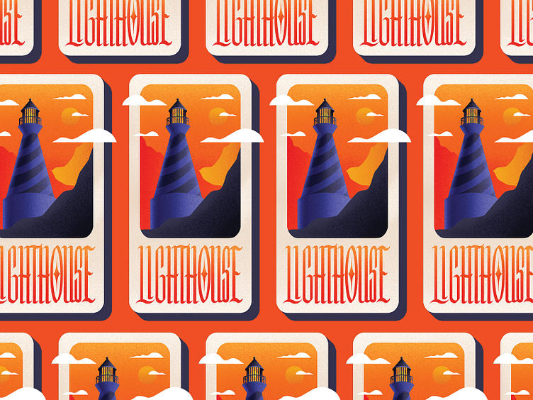
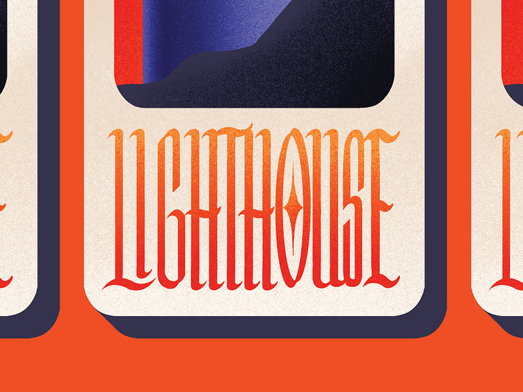
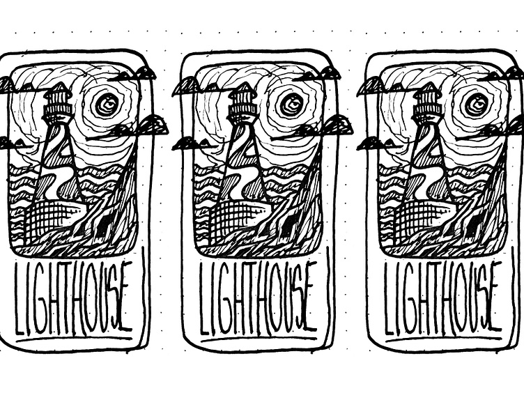
Thought i'd do a custom blackletter type treatment to go along with this one. Does it fit the illustration well? Thought it added some nice contrast to what i've typically been doing with standard sans-serif typefaces. And the subtle grain shading made this one a little different than the others in the series. Let me know what you think! Sketch/close up below. Follow more of my day to day work on Instagram.