Bionectar Brand Colors

When choosing colours for your brand is important to stand out from the rest and to don't loose meaning and sense behind them. Here is an example how we selected 7key tones to communicate "Bionectar" brand feeling.
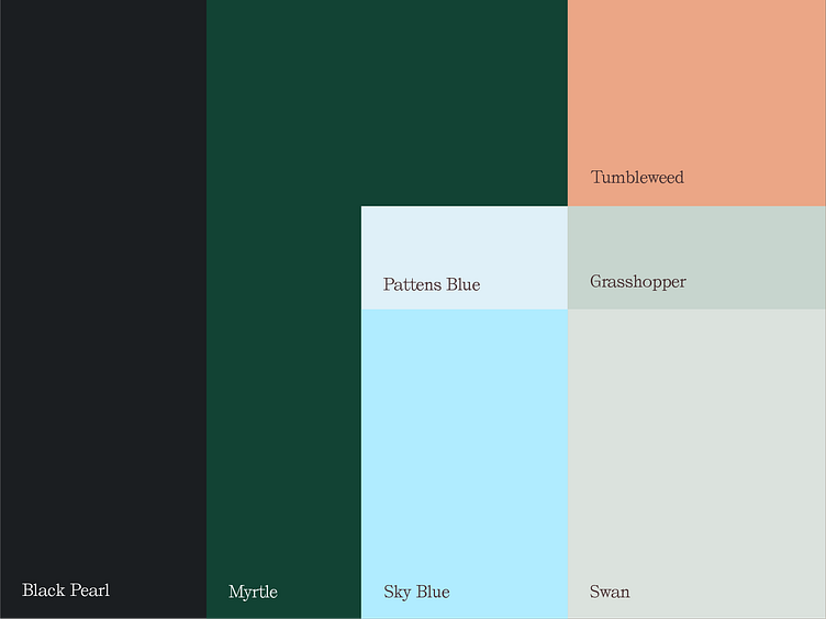
"Bionectar" utilizes a calming and natural palette featuring deep shades of #1b1e21 and #124334 for stability, complemented by tranquil hues like #dff0f8 and #b0ecff, evoking feelings of serenity. Warm tones such as #eba686 offer nurturing comfort, while #c7d5ce and #dbe2dd reinforce the brand's natural approach to alleviating menstrual pain, creating a cohesive ambiance of holistic relief and well-being.


