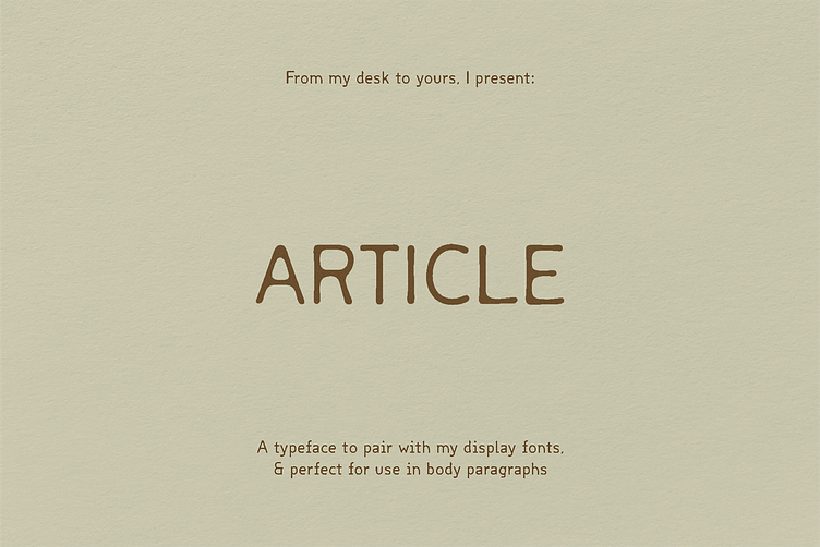
ARTICLE / Typeface

About the Project
A font to pair with bolder type that needs a companion equally as interesting, but happy to be the sidekick. Inspired loosely by mono fonts, because I gravitate towards them but find them too sterile and even to actually match the display typefaces I use most often. I made two versions, because one was too perfect in some applications, and the other was a little too softened.
Century, the regular style:
Inspired by monospace type, Article Century recalls to a time when humans and computers started to communicate. In a world where coding is not unlike a handwritten letter, this font is meant to reflect back on the type from an era past.
Millennium, the one that has more of a carved or worn-in look:
Ancient and wise beyond its years, Article Millenium has softened by the touch of humans over centuries. Like a staircase that is bowed in the center, where people step the most often, it shows its history in every wobbly edge. Every human's touch leaves a mark.
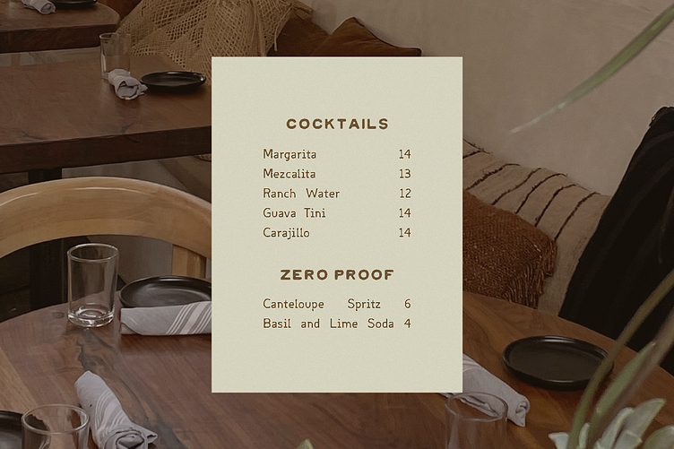
Note: My other typeface Cowboy is used in the images and is sold separately. These fonts make GREAT companions!!!