Motivation app. App Branding

Hi! Discover some valuable branding guidelines that can enhance your vision and establish a strong brand identity.
In this example, I aim to demonstrate how to align a product idea with design elements to create a cohesive brand. A brand embodies its own identity and persona—I'll elaborate on how to uncover this aspect.
Let's embark on a journey using this app as an example.
About the app:
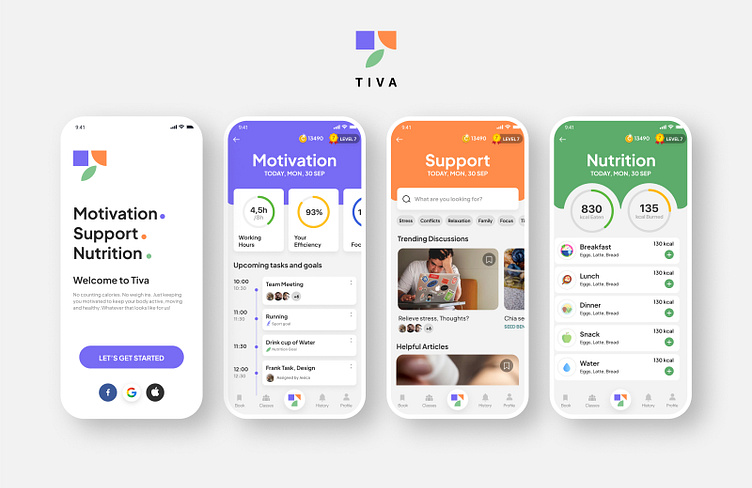
Balancing work and personal goals can be challenging as they often intertwine, leading to burnout. This app is designed to assist users in achieving equilibrium by managing both work and personal objectives while offering support and guidance on nutrition. The aim is to keep users active and motivated.
The app highlights three primary features:
Motivation: Users can track their personal and work goals, monitor progress, and view productivity data.
Support: Access to articles and forums provides a retreat from stress.
Nutrition: A nutrition map allows users to visualize their dietary intake.
I've discovered that an effective strategy for this layout involves the use of colors that complement the app's architecture. By applying this concept, I've developed a suitable logo layout and cohesive branding style that integrates colors and imagery, ensuring a unified user experience that is both comprehensible and memorable.
In conclusion, here are some key points to consider when creating a brand:
Identify and emphasize the unique features of the product. What sets it apart, and what problems does it solve?
Implement an effective strategy to differentiate these features. This could involve color schemes, shapes, patterns, symbols etc.
Maintain a delicate balance throughout the branding process.
Don't forget to give a thumbs up and subscribe for more insights!


