Landr - Mobile Web Concept

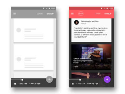
Concept of the new Landr landing page with Material Design in 24h. The typical flat button treatment and sticky nav bar, content cards in the focus of the screen and floating action button below.
The concept here was to introduce Landr to new users and encourage them to upload a music trek, so it gets mastered immediately while the user is browsing through the website. The floating action button changed from "plus" to "arrow" to showcase that people can signup and download their new trek right on the phone.
Read the full 24h redesign case study here:
https://medium.com/@stanbugaev/landr-the-material-redesign-in-24-hours-ef0e3149cae6#.a8ju7xmbt


