LeetCode's Landing Page Design

Greetings to all! I'm delighted to introduce the latest Landing Page design for LeetCode, the globally renowned coding platform.
LeetCode stands as the foremost destination for aspiring developers to cultivate and refine their coding prowess. Thus, it is paramount to provide them with an optimal coding environment.
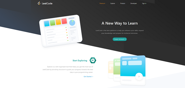
Current Problems in LeetCode's Landing Page design.
Outdated Design😑
An outdated design can give the impression that the platform is stagnant or not keeping up with industry standards. This may lead users to question the relevance and reliability of the content and resources offered.
In a field like coding where technology and trends evolve rapidly, an outdated design undermines the platform's credibility. Users may question whether the content and tools provided are up-to-date and relevant to current industry practices.
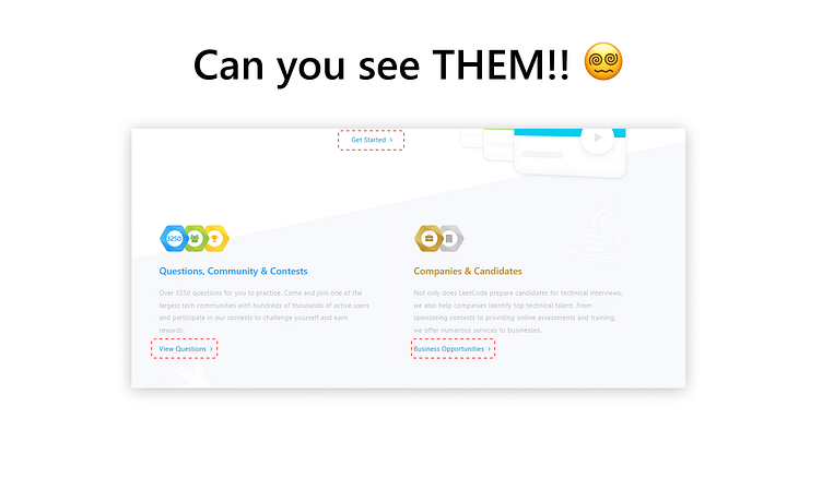
Lack of Clear CTAs
The absence of clear Call-to-Action (CTA) buttons in the image presents a significant usability issue. The buttons, such as "Get Started," "View Questions," and "Business Opportunities," blend in with the surrounding text, causing confusion for users. Without distinct visual cues, users may struggle to identify the actions they can take on the platform, leading to frustration and a potential loss of engagement.
No Footer 😱
LeetCode is the world's leading coding practice platform so it becomes very much crucial for them to provide best out of them.
Limited Navigation: Without a footer, users may find it challenging to navigate to specific sections of the website, such as coding challenges, tutorials, or discussion forums.
Limited Social Media Integration: Without social media links in the footer, users may miss opportunities to connect with Leetcode on various platforms, such as X(Formerly Twitter), or Facebook.
Competitive Analysis
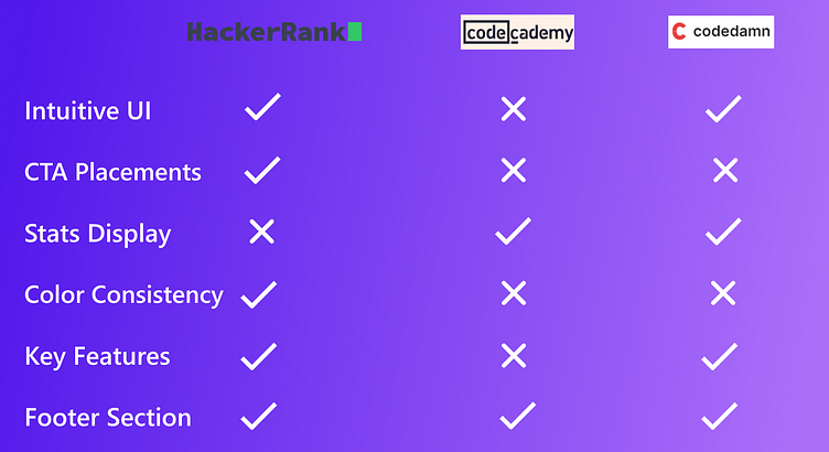
I have conducted a competitive analysis in terms of the intuitive Landing Page design for the coding practice platforms - Hackerrank, Codeacademy and Codedamn that provide similar servicesl like Leetcode.
One thing that stood out to me after the competitive analysis that CTA placements and Color consistency is necessary to foster the brand value and trust. Also, they collectively contribute to the intuitive UI design.
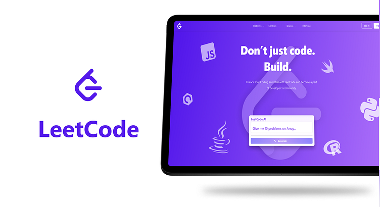
My Design 🤩
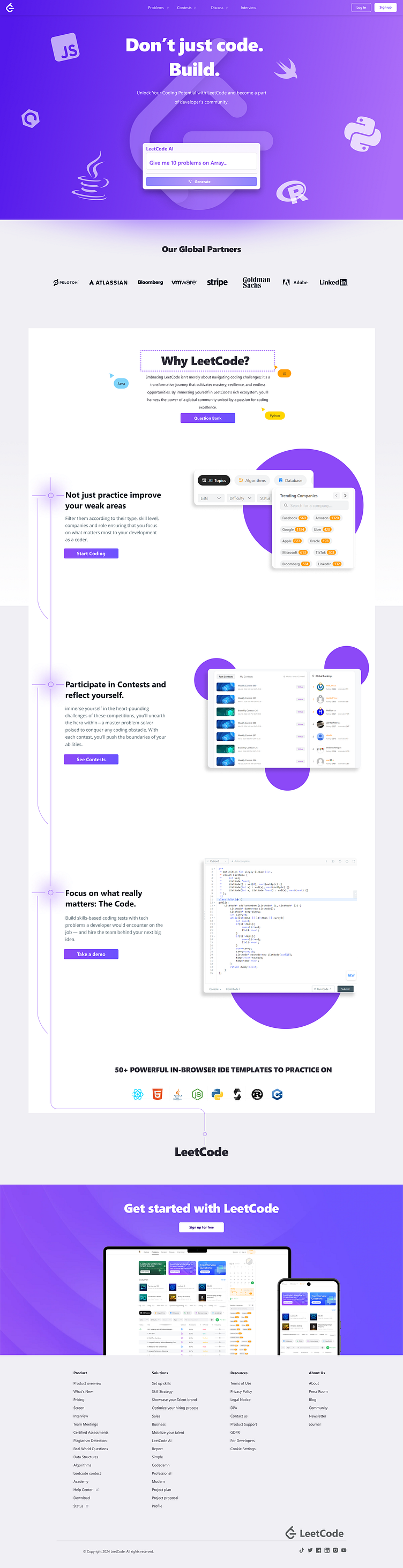
The design presented above embodies a modern approach aimed at enhancing the user experience throughout their journey on the website. Although the primary objective of a coding platform is to elevate the coding experience, it's essential to acknowledge the significance of making a strong first impression, as emphasized by the well-known idiom, "First Impression is the Last Impression."
Key Features:
1. A meticulously crafted hero section effectively communicates the brand's value proposition, complemented by a top navigation bar housing essential CTAs.
2. Integration of an AI prompt box within the hero section empowers users to test the platform's effectiveness. This feature enables users to generate AI-based responses, such as requesting specific coding challenges like "Give me 10 questions on array and linked list."
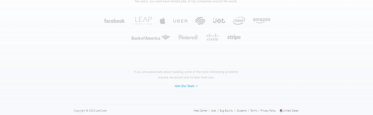
3. Placement of a global partners section beneath the hero section underscores the brand's credibility and fosters user trust by showcasing key value attributes through partnerships.
4. A dedicated section outlines compelling reasons why users should choose LeetCode as their preferred platform to embark on their coding journey.
5. A comprehensive footer section situated at the bottom of the page houses essential social media links and other navigation menus, ensuring seamless access to additional resources and fostering community engagement.