07/32 – San Jose Outlaws

Slingin' in the Sun
The San Jose Outlaws are the third team in the Pacific Division of the West Conference.
Despite being one of the original franchises to have never changed team name or location since 2005, the Outlaws have struggled to find an identity on the field in the past few seasons. Their lone championship game appearance was in Season 11 where they fell to Dallas but they have managed to climb back in to the playoffs and get a Wild Card win in Season 26.

Visual Direction
Another quirky team – the San Jose Outlaws have always been the San Jose Outlaws but they weren't named after anything related to Silicon Valley itself. The name sprouted from the term "gunslinger quarterback", the ultimate risk-taking playmaker in the backfield, and its real-world association with outlaws in the wild west of old. San Jose just happened to land the Outlaws name.
The visual identity, however, takes root in the city. The color scheme and striping conventions are pulled directly from the blue and gold municipal flag and typography is seasoned with some southern California spice.
Execution
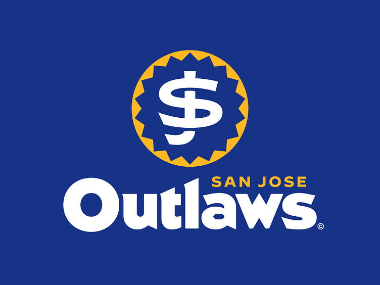
The Outlaws' primary logo is an interlocking "SJ" with lightly flared serifs inside of a geometric sunburst inspired by the sun in the City of San Jose logo. The flares in the letterforms are cut to flow with the inner edges of the sunburst.
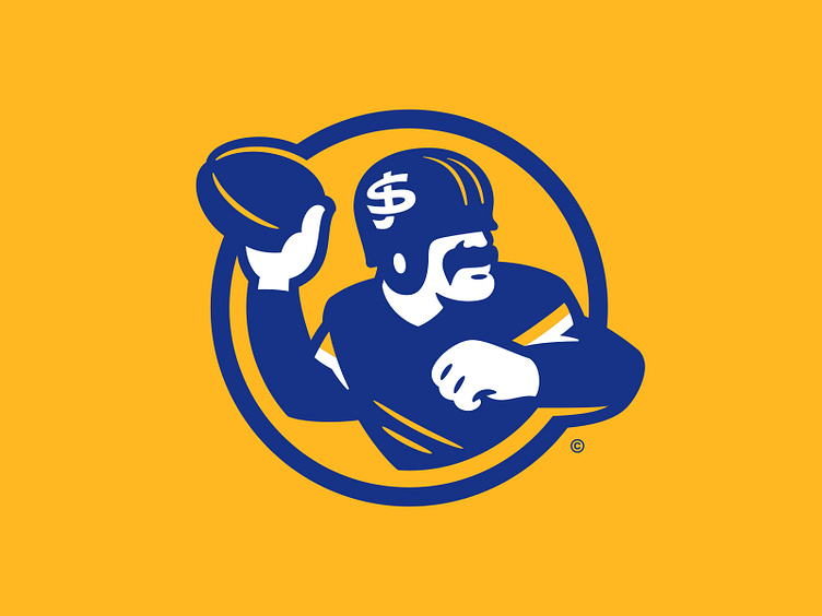
Enter the "Slingin' Outlaw" in the secondary logo spot. This vintage-inspired mascot illustrates a tough wild west outlaw suited up in the team's primary blue uniform with a blue helmet – locked, loaded, and ready to launch the rock. The helmet in this depiction incorporates the same interlocking "SJ" from the primary but pulled out of the sunburst container.
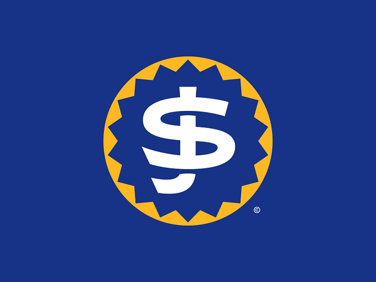
The partial third logo, as previously mentioned, is the interlocking "SJ" logo on its own without the heat of the sun.
The typography for this team was inspired by old tech and its geometric styling but with a modern take. In the titlecase wordmark, the "O" compliments the perfect circle of the sunburst and each letterform takes on sharp points and lightly flared serifs for some flavor. Built directly from this is an all-caps city name and team name version with slightly more condensed proportions. These versions are featured on the team's uniforms and in the endzones.
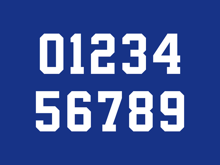
San Jose uses a more traditionally-styled athletic block, shared by a few other UFL teams, on their uniforms. This look reinforces the legacy of this team as one of the original franchises.
Going for it All
The San Jose Outlaws now have a refreshed look with a complete graphic suite (and the Slingin' Outlaw finally gets the recognition he deserves). If we had any say in the matter, we'd love to see these logos launch them towards another lengthy playoff run in Season 28.
Football Helmet Mockup by SportsTemplates
____________________


