Meditation Logo Branding - Arcmed ✨


✦
Meditation Logo Branding - Arcmed ✨
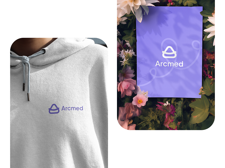
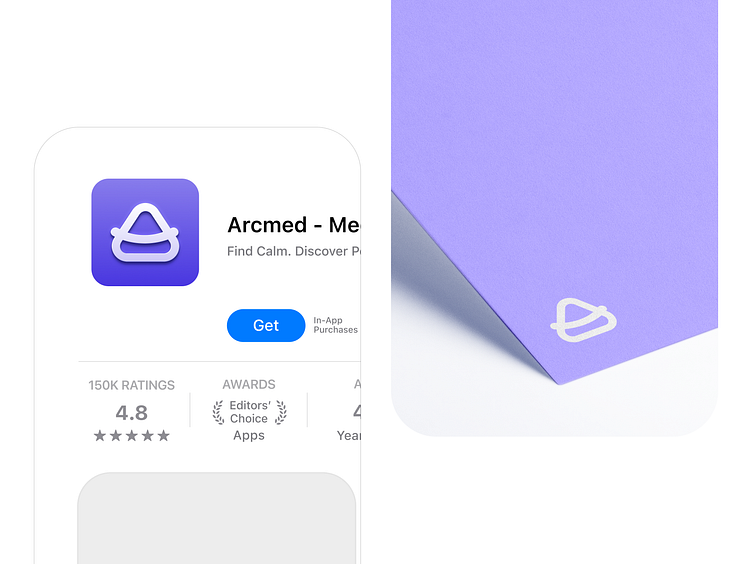
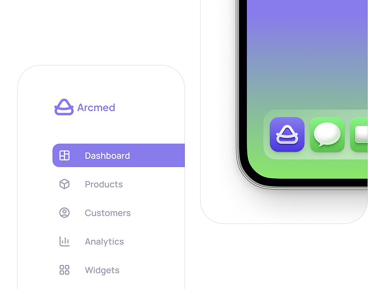
● This design represents the journey of meditation, guiding you from a state of busyness and fragmentation (represented by the sharp angles) towards a place of inner peace and wholeness (represented by the Polygon). The calming purple and green hues reflect the sense of tranquility you'll find on the Arcmed platform.
● Just like the pathway winding through a serene landscape, Arcmed's guided meditations will take you on a personalized path to mindfulness and emotional well-being. With Arcmed, you'll find the tools and support you need to de-stress, improve your focus, and sleep better.
● We are passionate about making meditation accessible to everyone, and we believe that our new logo reflects this commitment. Arcmed is a safe space for you to connect with yourself and find moments of peace in your everyday life.

Mockup View 👀
• Dream Team
🪄 Visual Designer @Mamdism
💡 Motion Designer @Shahrestani
✱
XOLAB ⚡️ 360 Design Agency
Hire us! xolabteam@gmail.com